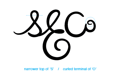
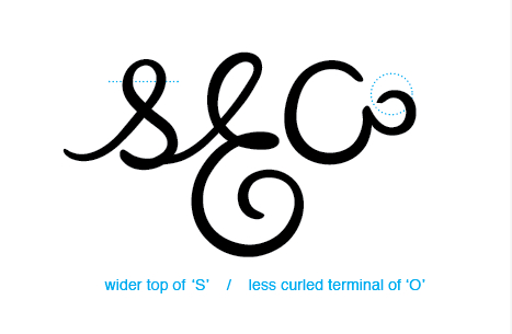
Hey guys. I'm working on this logo for a company with the initials S.E.Co, and this is a special version of the logo that will only be used on one specific product. To be completely transparent without giving away too much, the logo us a subtle homage to GE, hence the big curly E.
Any help would be very much appreciated.I need help with.
1) The terminal of the O: I like that it is not a correct script O, that it almost just feels like a flourish off of the C, but not sure how to finish it
2) The S: wider or narrower up top?
3) The overall weight and feel of the mark. I'm an amateur and I just might be missing some glaring problems.
THANKS!