Typophile

Font Aid V: Made For Japan

This thread ran to 4 pages of replies and only 2 were recovered, so replies are missing.

The capture this came from was cut short by the archive that made it, so the text may be incomplete.

The Society of Typographic Aficionados is organizing Font Aid V: Made For Japan, a project uniting the typographic and design communities with a goal of raising funds to expedite relief efforts after the recent earthquake and tsunami in Japan. We hope to be able to complete something akin to the Font Aid IV: Coming Together typeface, which was created to benefit the victims of the 2010 Haitian earthquake.

Update! The project theme and submission guidelines have been posted.

Update! The typeface now has a name … “Made For Japan”

Thanks in advance for your help.

— Grant

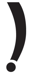
Here's my first attempt. Maybe I'm taking the challenge too literally, but I liked this from the wikipedia definition:

" they cannot be regarded as 'useless' in an absolute sense, since they do actually solve a problem; however, in practical terms, they cannot positively be called "useful."

So I give you the exclamenthesis, perfect for when you need to put something in parentheses and you REALLY mean it.

Jonathan, I think you need a 180 degree rotated version too, for opening parenthesis à la Spanish opening exclamation.

I was thinking that, but I didn't want hog another glyph. Plus, I thought maybe it would be funnier if the phrase just had the exclamenthesis at the ned. We'll see!

I don't want to make more work for anyone, but I'm wondering if it might be cool/funny/useful to have a little description about each glyph in the book. The Haiti project was self explanatory, since everything was ampersands; but here, with there being a lot more freedom, it would be nice to know what the designer was thinking with each glyph.

@jonathan
Thanks for the great suggestion. We were thinking about the book component of this project. You’re absolutely right … documenting some of the thought process behind each submission would be both interesting and more personal. I have updated the submission guidelines with a request for an optional description for each glyph.

I will posting these guidelines and other information on the SOTA website as soon as I have access to the server again. The airport wifi in Denver is blocking FTP transfers right now.

… I'm wondering if it might be cool/funny/useful to have a little description about each glyph in the book. …; but here, with there being a lot more freedom, it would be nice to know what the designer was thinking with each glyph.

Useful? Cool?? Funny???

In this very hour they are sitting down with nothing left.
And you are fuzzing about a silly bastard glyph, claiming wit for it.
Do you think this will raise funds for the human aid needed?

It’s not my project, but I would consider a revision of the briefing.

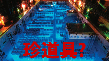
I wonder if an unsealed pool of water for storing spent nuclear fuel rods is an example of chindōgu?

...ingenious everyday gadgets that, on the face of it, seem like an ideal solution to a particular problem. However ... anyone actually attempting to use one of these inventions would find that it causes so many new problems, or such significant social embarrassment, that effectively it has no utility whatsoever.

re: Andreas & cool/funny/useful

Humor is important, and deserves as much celebration in bad times by those who can, in an effort to honor those who can not. Celebrate life if you can... Help in some way if you can... Fun & Funny obviously dose not mean to degrade or insult.

~

"In this very hour they are sitting down with nothing left.
And you are fuzzing about a silly bastard glyph, claiming wit for it.
Do you think this will raise funds for the human aid needed?"

I'm positive that everyone who will be involved in this project is well aware of the horrible conditions in Japan. I would also guess that for many of the people involved, their willingness to help will not end with this project. In an effort to raise funds to help the people of Japan, I don't think it's in poor taste to celebrate something uniquely Japanese in a way that's in the spirit of that thing. So yes, I think we should be concerned with making it useful, cool, and funny if being useful, cool, and funny helps raise more money. I think it will.

I have been receiving some comments outside of Typophile about the whole idea of “usefulness” vs “chindōgu”.

Ultimately, we are attempting to create is something thoughtful, beautiful, and intriguing. If usefulness (or humour) springs out of the images that are created for Font Aid V, all the better. Remember, we are an extremely talented and empathetic community that can (and will) make wonderful things to help others.

Let’s just focus on that.

Thanks for listening.

I think it is more important to move on with the project than to beat on the concept brief as a committee. We have all been the committee rout, "Lay on McDuff!"

I made previous and next buttons. It's Showa-era squareness with a little temple roof curve. Luckily, before submitting it my wife walked by and noticed I'd drawn the wrong kanji (uni5148) for previous.

Humor is important … Celebrate life if you can

Some out here know my sense of humor. I always smile if there is something funny.

I was only wondering if the kind of ‘ideas’ will really be helpful.
Perhaps I’m too sceptic this time.

~ It is my natural tendency to get carried away...

The internet tells me that the Noh mask- "Ko-beshimi is used for sorrowful demons." so this seems appropriate, though I've never visited Japan, and I really know nothing of kabuki... I'm not sure if these abstractions of the mask would be seen as offensive in this context, but it is a connotative association for me.

~ Thoughts?

I love both of these iterations, Brock.

Nice balance of abstraction and subtlety.

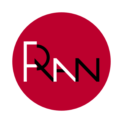
Hi folks, here is one of my contributions based on the word "ran" which means "chaos" in japanese (see also the wonderful film "ran" by akira kurosawa) :

IMHO Ray (Typodermic) is onto the right approach here - ability to use the font after the fact will help sales - sales help the people.

@1895, I agree with you, in as much as I wish I hadn't put my nonsense process up here... but, I think personal work can also be of use, and as a document of an attitude or a reaction to this event at this time, from this community, I think the collection itself can be pretty special, 5 years, 10 years down the road...

I would just saying that, after submitting your glyph(s), you already can donate through http://sogojapan.org/ and receive a special cut of Angel Script.

@brockfrench - sorry I didn't mean any disrespect.

.

First draft for my submission: Nō mask effect smileys


http://www.kasrl.org/noh_mask.html

Any and all suggestions/critiques welcome :-)

@1985 - I know you didn't. I didn't take it as such.

I can't wait to see how this font turns out. I love the idea of everyone doing their own thing for this project. Buyers might prefer it or they might not: we don't know. Next time around, we'll know. I have a feeling this approach is better because it offers something for everyone. Some customers will buy this font and find themselves doing a project where Japanese themed imagery is needed. Some will have a need for manga word balloons. Some will want a lone @ sign. Having a wider variety of glyphs to choose from should make the font more useful. If we would have stuck to variations of one symbol, a customer might use some of them but it's unlikely that they'd use several. Give the customer a variety of glyphs and the chances of those glyphs being used goes up because situations which require their use will be more frequent. The more frequently glyphs are used, the more exposure they get. People who see designs using those glyphs might ask the designer where they got that arrow, noh mask etc. That can end up spreading the idea of Font Aid even further.

“I can't wait to see how this font turns out.”

Me either.

In additional to the sneak peeks in this thread, there are some gorgeous things being submitted … whether they’re immediately useful or not is a completely subjective matter.

I’m convinced that throwing the doors wide open was the right thing to do.

My FontAid ampersand Haiti poster was featured in the USA Today photo Gallery in today's issue.

http://usat.ly/fyQ9O9 via @USATODAY

“I’m convinced that throwing the doors wide open was the right thing to do.”

Yep, exactly ; here is another submission:

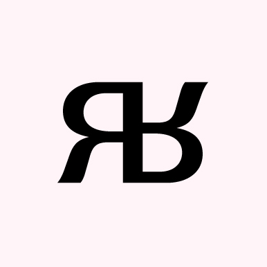
Formed from the first and the last letter of the word "япония",Japan in bulgarian, read "yaponiya".

Here is my third contribution:

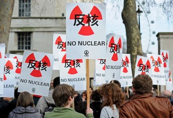
My Japanese anti-nuclear flag design was picked up by the CND for their protest against nuclear power in London yesterday.

Way togo, John!!!

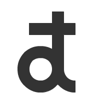
There’s a glyph I’m toying with from time to time:


It’s an a-t ligature (as in @), which has an hiragana (http://en.wikipedia.org/wiki/Hiragana) feel.
But, having maxed out the allocated slots with the above Nō masks, I will not submit it.
So, if anyone need some inspiration, please feel free to use and improve it :-)

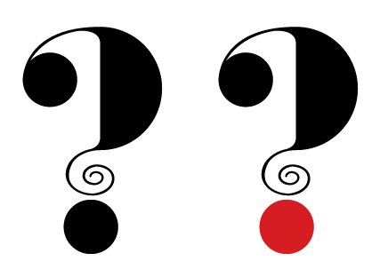
I know question marks were done in Font Aid II, but I’m putting my focus on that character for this project. The incidents in Japan raise so many questions about that nation’s future, and about what the rest of us will do regarding preparedness, nuclear power, etc. The glyph that I submit to SOTA will be all black, as the specs suggest; I’m just showing a red circle to make the connection to Japan (overly) obvious.

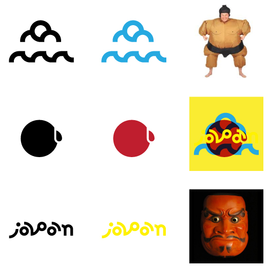
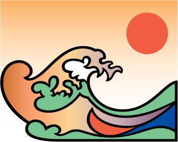
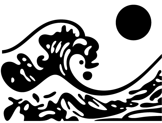
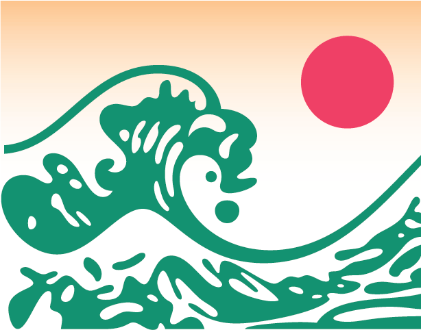
Mine is inspired by the famous Hokusai block print of the wave. The curves need more work than the one day I've given them but here is the basic idea. One in BW and the other in color.

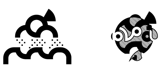
After another days work, I think this is a better solution. Still using the Hokusai wave idea but with an anguished Kabuki or perhaps Noh mask profile subtly emerging from the top part of the wave

Nice stuff being done! I'm diggin' the developmental work too.

Nice use of the wave pattern Dez, lots of possibilities.


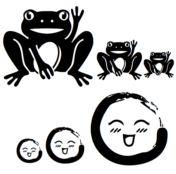
The first glyph combines two Japanese symbols for good fortune. Maneki Neko is a common ceramic sculpture of a cat with an upright paw, often holding a coin, inviting luck. Frogs are also associated with good fortune, especially in travel, perhaps because the word for "frog," kaeru, also means "to return." This frog, assuming the position of the beckoning cat, is a wish for good fortune to return to Japan.

The second glyph combines two vital traditions of Japanese art: the calligraphy of Zen Buddhist painting and the playfulness of contemporary manga comics. The form of the circle, called ensō, is a common, polyvalent symbol appearing in calligraphy. Usually painted in one stroke, the painted ensō is a particular and imperfect expression of the absolute and perfect. This happy ensō has a face inspired by manga in the supercute "chibi" style.

Thanks to my daughter for editing suggestions and to SoTA for organizing the project.


New improved ensō face after further input from my daughter!

@john I don’t there’s any reason why you shouldn’t create a question mark, ampersand, fleuron, or what have you for this project. If the imagery fits, so be it.

Thanks again to everyone for showing your creative process and submitting your work.

We’ve received over 150 glyphs from 80 contributors.

Keep ’em coming.

I guess it is deadline time. Here are my last efforts:

Here is my threefold contribution, as a sum up:

I'm amazed by all contributions around here. The Font Aid V will be a great edition. How infortunate such catastrophe have to happen in order for us to work as a team...

I designed a flower from four (identical) heart shapes. It stands for all the love and growth, care and help I wish for Japan and its people. Of course the submission had to be in black and white. I added the gradient later.

I tried to wrap my head around the concept for this project. The ampersands were much easier. I'm not certain that these are appropriate. The mask is based on a mask I made for my brother during his semipro wrestling days. They billed him as the shadow something or ninja something, I can't remember. I just remember looking at a lot of Japanese masks and helmet designs. Good, bad or indifferent, this will be the submission for the Fontry. I hope it helps.

1) Magic ball - Things that Japanese made and do are magical. Magical philosophy of living.
2) Japan gate - Famous torii stylized with sun and mountain.
3) Clock - Same stylization of sun and mountain, in another context - respect for time in everyday life.

:)

@Grant.

Was an email confirmation of receipt of entries sent out? I just want verification that they arrived?

Ditto!


Here are the glyphs I submitted. The first is based on the map glyph for hot springs that I modified to include heart shapes and it wounded up looking like a turnip. It works better in a color treatment. The other is a bean.

Praise be to Grant and company for getting this suckah on the road!

I can't think of any other event that makes me giddy to spend money!

hhp

A colleague has just asked me a good question: anyone have any idea how much was actually raised by previous iterations of this project (say, for Haiti via Font Aid IV)?

A good question indeed. More so since it is still on sale:
http://new.myfonts.com/foundry/Font_Aid/

Of course. For “was”, read “has thus far been” :^)

Still no sighting of the new Japan version there. Sometimes it takes a while for MyFonts to post it.

Hooray! It's out. I'm making a purchase at Veer.

Great!
Shame the eventual timing coincides with the start of Movember though. Now there's a thought - a font of moustachioed faces...

Hmm: I've placed my purchase at Veer but it says "download unavailable". Anybody else getting that?

Yes, I am getting the same message, dtw. I am trying to be patient, on the assumption that the download link will work soon.

Here are the numbers. I did a presentation on this at Typecon last summer.

Font Aid 1 raised $2000 for UNICEF

Font Aid 2 raised $5000 for victims of 9.11

Font Aid 3 had 3 components. The font itself raised $10,000. An additional $10,000 was raised through a project called Building Letters and another $12,000 was raised from font vendors donating the proceeds from their top selling fonts on MyFonts for 1 month. The money went to help victims of the Indian Ocean earthquake and tsunami.

Font Aid 4 raised $13,500 for victims of the earthquake in Haiti.

Can't wait to see Font Aid 5 top these numbers!

I just purchased the font from Veer and installed it. I'm blow away by the quality of the submissions. The level of effort that went into this is very evident. Congrats to Grant and his team for getting this completed!

Thanks for the stats Michelle; and clearly the folks at Veer have fixed whatever the problem was that John and I were experiencing yesterday, as it's now downloading OK. :^)

I'll ditto dtw's thanks to Michelle for the info about funds raised. Also, my download from Veer worked fine this morning. I've got it installed and I'm enjoying the examination of all those glyphs.

Thank you Michelle!

Transparent is the new black.

hhp

Are there plans for a booklet similar to the ampersand version?Or at least a pdf of one to include with purchase?

I very well hope so!

“Praise be to Grant and company for getting this suckah on the road!”
And what a road it’s been. Oof.

“Still no sighting of the new Japan version there. Sometimes it takes a while for MyFonts to post it.”

I’m waiting to hear back from MyFonts this week, as well as Ascender/Linotype/Fonts.com … soon, I hope.

“I’ve placed my purchase at Veer but it says ‘download unavailable’. Anybody else getting that?”

There was an initial glitch with the product data when Veer loaded the font into their system. It was corrected swiftly by the goodly Veer crew. Please let me know if you see any other issues and we’ll get them fixed right away.

“Here are the numbers.”

Thanks for posting these, Michelle. I‘m thinking we should add this information to the Font Aid background page on the SOTA site.

“Are there plans for a booklet similar to the ampersand version?”

I’d love to do something like this, but I’m swamped. I have been chatting with a designer about doing a poster featuring the entire glyph set, but we’ll have to see. I’m certainly open to suggestions.

Thanks to everyone for being so patient while this project dragged out.

Perhaps a fabric with the entire glyph set or even a quilt? Possibly a poster printed on rice paper?

Please let me know if you see any other issues and we’ll get them fixed right away.

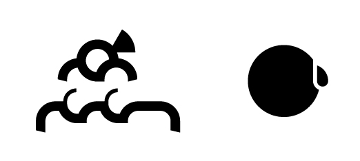
I've noticed on the Veer site that some glyphs seem to have zero advance width. (Type HHHTHHH or HHHSHHH to see examples.) Dunno if it's an error in the font or in the website's type tester.

Bummer, I was really hoping to use it for an article in Ray Gun. ;-)

hhp

S and T have no right side bearing. The left sidebearing of U is 964 units--I assume that is not intensional. I opened the font in FontLab to check.

I can understand how typing "STU" in succession would work as combination of 3 glyphs to create a crowd scene but why not do it with either kerning or contextual alternates? I assume most people who use this font will be rather surprised to find overlaps and huge spaces when they just type one of the 3 glyphs?

Chris: well spotted. In fact, two of the three characters have got cutout areas by their elbows to allow overlap. So perhaps the whole crowd should have been one big glyph?

“So perhaps the whole crowd should have been one big glyph?”

That series of glyphs were originally a single glyph, but it had to split up due to the number of nodes. There may have been a different way to approach splitting up the image, but this was the solution that Delve Withrington came up with. If it proves to be an issue for people, we could go back and release an updated font file.

Thank you Michelle,
I just came on this knowledgeable discussion and i want to share some point here. I have purchased the font from Veer and i have been installed it as well, it's working fine for me.
Captured from commoncrawl.org on 28 Apr 2015. original URL