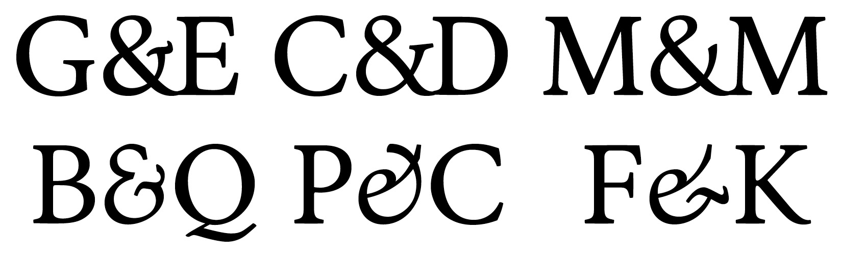
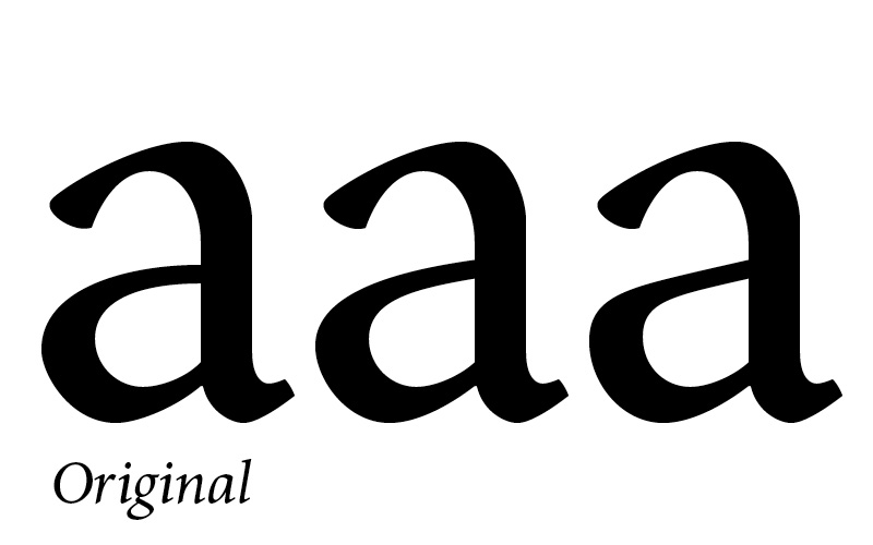
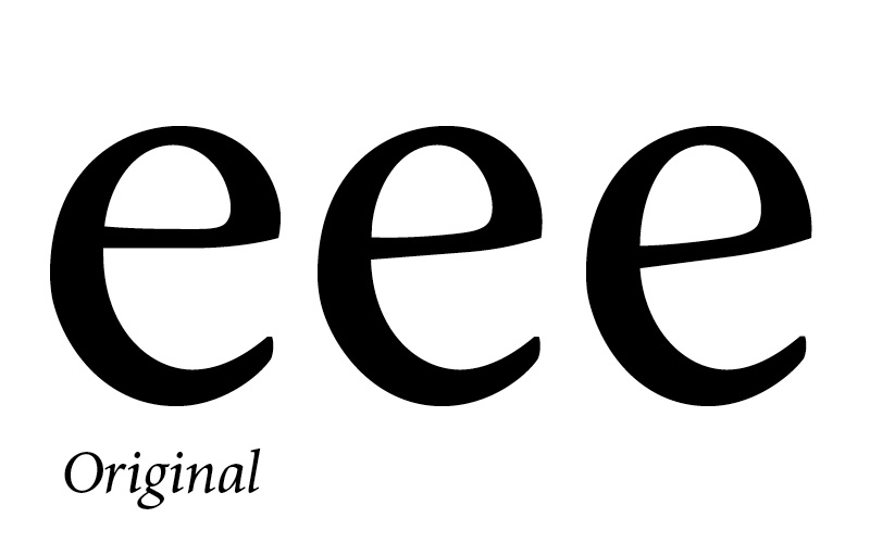
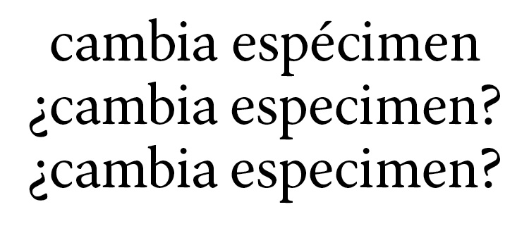
On August 2009 I decided to make this book typeface.
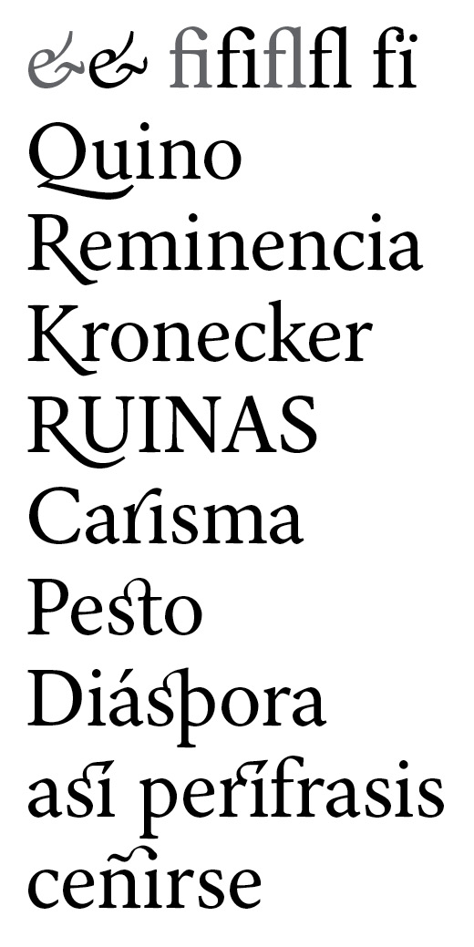
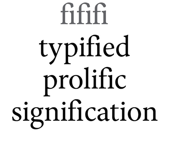
While reading a book on September, I was caught by an ff ligature (I know, cliché, but I can't change the facts), and for the first time I became interested in typography and design. I started to read a few of books about typography, including The Elements of Typographic Style (of course), taught myself calligraphy and began working on Rhetorica right away. The Regular and Bold style were constructed using exclusively FontLab. By contrast, the Italic style was based on my hand-script, and then fine-tuned in Fontlab.
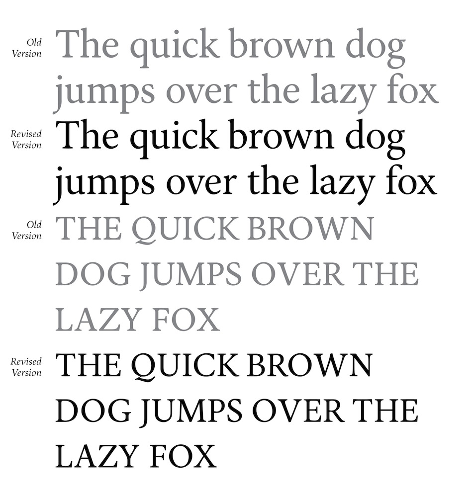
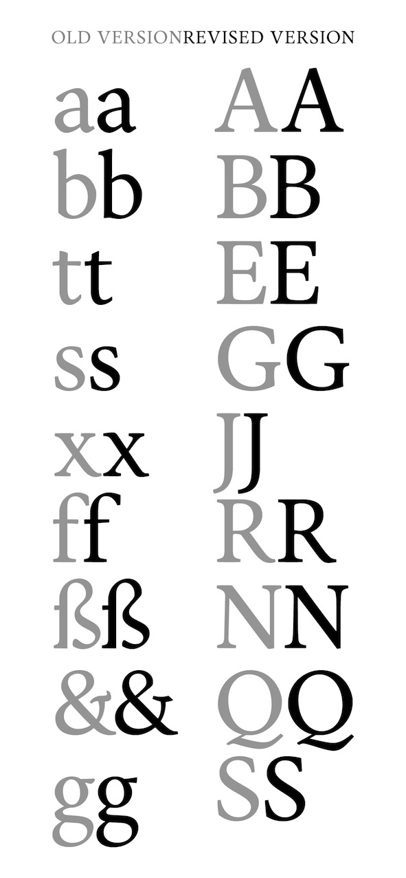
After a pause of six months, now I had time to resume the design. The character set has grown, and with it my knowledge of the dynamic of shape has improved.
All kinds of comments are welcome. Main point it help's me build up Rhetorica. I'm sure I have something to learn from most people here; I just hope they share their knowledge to me c:
***
The most recent SPECIMEN can be found HERE. (Sorry, I've had problems uploading it directly to typophile).
| Attachment | Size |
|---|---|
| Specimen (27.03) | 461.98 KB |
| Specimen (8.03) | 438.85 KB |
| Revision Sample (8.03) | 63.65 KB |
| Specimen (16.04) | 41.42 KB |