
I'm helping a classmate look for any info. leading to samples of Jan Tschichold's Saskia typeface. To our knowledge, it hasn't been digitized, but it's also difficult to find any printed samples or images online. Any help would be appreciated.
I'm helping a classmate look for any info. leading to samples of Jan Tschichold's Saskia typeface. To our knowledge, it hasn't been digitized, but it's also difficult to find any printed samples or images online. Any help would be appreciated.

I don’t think so. It was discussed half a year ago on typophile:
http://www.typophile.com/node/72292
Thank you thank you!
(how did I miss these?!)

An old unsharp snapshot, but I can take a better one for you if you want.
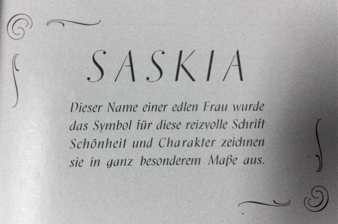

Unbelievable, actually, that Saskia escaped digitalization so far.
Who will win that race?
A bit off topic but loosely related: an exhibition on type design opens tomorrow at a venue in Leipzig. – Just if you happen to be in the area. (It spans the focus on local matadors of the trade, from e.g. Belwe, Tiemann, Tschichold, Drescher, Kapr, K.-H. Lange, to those of us who continue the business nowadays). – I’ll report something later on.

Help a ’merican understand: why a 'ch' ligature in "Schrift" and "zeichnen" but not "Schönheit"? And why a 'ch' lig at all?

Schönheit and Charakter are letterspaced = bold.
Presumably Saskia has no Bold, in the manner of old fraktur, where this convention for emphasis originated.
Allegro makes a good bold for this:
http://www.identifont.com/show?21W
c is only ever followed by h or k in German, so making these ligatures was an efficiency.
Captured from commoncrawl.org on 28 Apr 2015. original URL
