
Any ideas?

Any ideas?

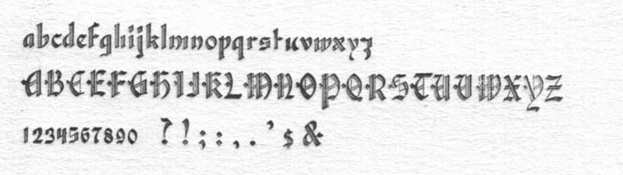
The top one looks like a variation of Ronaldson, although I don't know where you can find that wide version:
http://new.myfonts.com/fonts/canadatype/ronaldson/
Jason C
The serif treatment is similar to Ronaldson, but some of the more unusual characters would suggest the first one is something else. Note the R, the serif at the top of the A, the compressed loop on the g, the serif at the top of the 4.
Captured from web.archive.org on 23 Aug 2013. view this capture