Typophile

New release: Camphor

I am delighted to announce the release of my first commercial font, Camphor™ now available in six weights with corresponding italics from Fonts.com, Linotype.com and ITCFonts.com. (Camphor™ is also available to commercial subscribers of Fonts.com Web Fonts.)
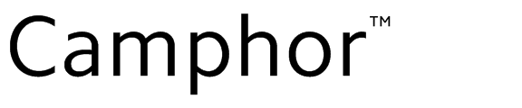

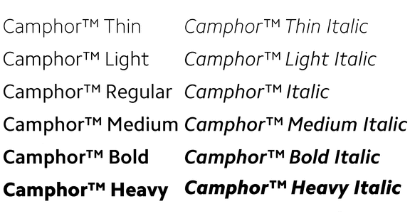
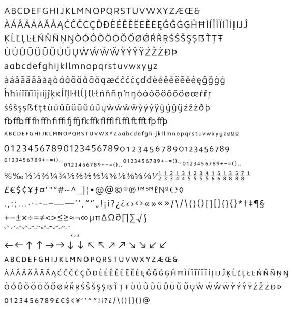
Camphor™ comes in OpenType Standard and Pro formats with broad support for Central and Eastern European langauages.
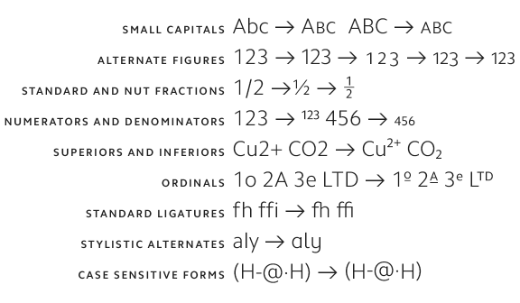
OpenType features include:
A pdf can be viewed here.

The press release can be viewed here.

Congrats and good luck Nick!
Is that two different small capitals features shown (smallcaps & c2sc), or does the font recognize when the feature is applied to all-caps strings and convert them differently?

>>>Is that two different small capitals features shown (smallcaps & c2sc)

There are four features that effect small caps:
- aalt changes lower and upper case to small caps
- smcp changes lower case only to small caps
- c2sc changes upper case only to small caps
- ss03 changes numerals to small cap numerals

Nice work Nick. Congratulations!

Congrats, Nick. Great job!
It seems the small cap E with dot above has the diacritic slight misaligned.

>>>It seems the small cap E with dot above has the diacritic slight misaligned.

It's the same horizontal positioning as the caron, circumflex and dieresis. Should be fine. Maybe the image doesn't help?

Solid work!

Maybe the image doesn't help?

Yes, it's a low resolution artifact. With the PDF file I see diacritics above E are consistent (maybe a bit towards left, but this is my taste and not a problem). Again, a very nice release.

Thanks, Igor. The accent placement over an /E/ was a struggle between visually centering it over the top arm and centering it on the centre of gravity of the /E/ which is further to the left (which is where I've gone with Camphor). Believe me, I spent a long time deciding!

...I spent a long time deciding! And achieved a really good result. My preference is just a personal taste. I also liked very much the nut fractions and ordinals.

Wow Nick! Congratulations with a great release. Looks like a friendlier version of Verdana, which is a good thing, off coarse. A workhorse with class. Not your last release I hope?

Congrats on your first release!

Nicely done.
I'm particularly impressed by the thoroughness of typographic support, with the inclusion of superior capitals, both superior and numerator/superscript figure alignment, nut fractions and f-thorn ligatures (!).

Sorry, but I don't get the flag-waving.
In this day and age, geared to an international market, this doesn't strike me as being particularly English, especially with its European single-bowl "g" and Univers-style ampersand.

Congratulations, loving the pilcrow!

Congratulations Nick, this is splendid! Very clean and unpretentious.

I'm curious about the fl ligs: the pdf shows they are all connected except the versions with the alternate l...what's the reasoning behind that?

Good spot, Ben. I only noticed the /fl.alt/ and /ffl.alt/ not being joined up when you mentioned it. (They are still two/three separate characters in the pdf!?) The capture of the character set above shows how it actually looks.

Hey Nick, I don't really wanna sound ignorant but... what Univers–style ampersand?

It's an ampersand (&) shaped like the one in the face Univers.

Not all versions of Univers appear to have the 'Et' ampersand. I'm assuming the original version had it but then the digitised version seems to have replaced it? Now in Linotype Univers (1999), guess what, it's back! That might be a somewhat simplistic way of looking at the history of the Univers ampersand, so someone in the know might like to flesh it out a little.

As a matter of fact, Camphor's ampersand does not have the ascender on the 't' part of the the Et (it's more of a small caps T). Not altogther sure what influenced me on the Camphor ampersand. If it was Univers, it was pretty subliminal. Fairly sure I just went for a horizontally flipped 3 as a starting point and went on from there.

My understanding (completely subjective, as I've not done any statistical analysis) is that the Anglo* ampersand is a single stroke "eight-ish" shape, whereas the Continental model involves at least one extra stroke, and is more discernibly "E + t".

I name-checked Univers, recalling that there had been some objection to its Et form of ampersand in the Anglosphere, with the substitution of the more normal, for there, shape in later editions of the typeface.

*Also preferred in the former colonies.

Yeah, the Univers ampersand I knew didn't have the “Et” ampersand. Thanks for the lesson!

A few fonts other than Univers have an 'Et' ampersand. If you have Zurich BT or Trebuchet MS, you can see it there. If not, Universalis ADF does have it.

I missed this release, I was "out of order" for some time. I like this typeface; thanks, is really good; I like numbers, and I'm sorry I couldn't use your font on some diaries I just designed. But still in time for new projects :-)
Daniele

Captured from commoncrawl.org on 19 Apr 2015. original URL