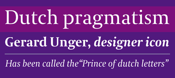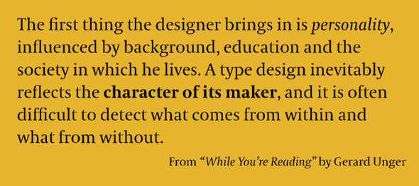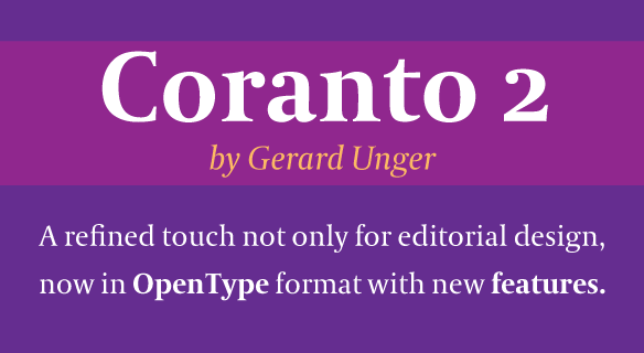
We are very happy to welcome Gerard Unger and his typeface Coranto 2 to the TypeTogether family. Gerard is an internationally acclaimed designer whose work and teachings have, for years, inspired many others to follow in his footsteps. He has earned numerous Dutch and international prizes and honours, including two honorary doctorates by the universities of Hasselt, Belgium and Tallinn, Estonia. He publishes articles and lectures internationally, and his book Terwijl je leest — about reading — has been translated into English, Italian, Spanish and German.
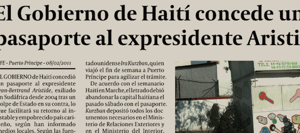
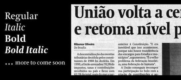
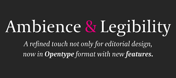
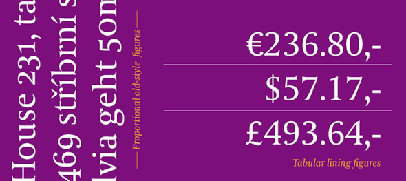
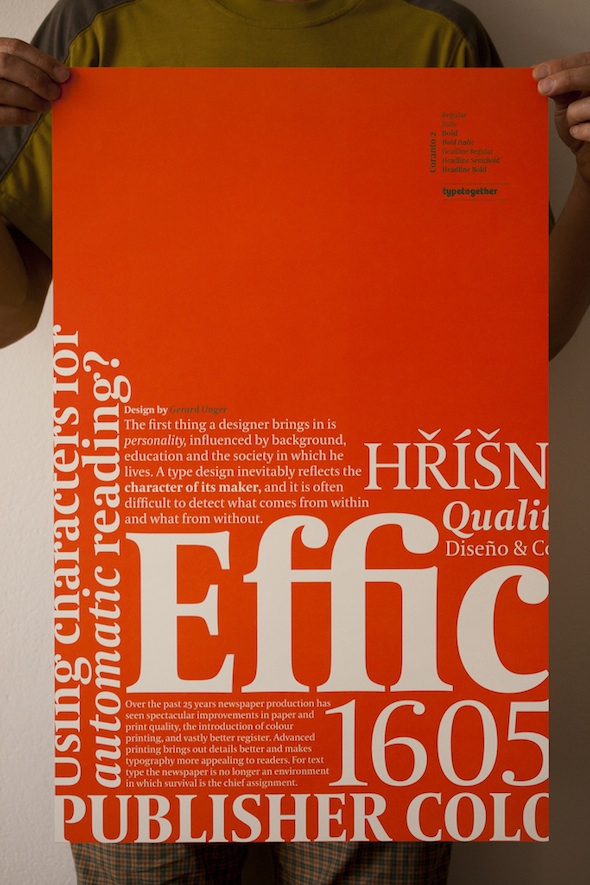
Coranto 2 is originally based on Unger’s typeface Paradox, and arose from a desire to transfer the elegance and refinement of that type to newsprint. This update to the original Coranto includes the addition of over 250 glyphs featuring full Latin A language support (which includes the necessary accented letters for Northern and Central European languages), redesign of most accents, new ligatures, 4 sets of numerals, arbitrary fractions and superiors/inferiors. Furthermore, kerning was added and fine-tuned for better performance.
more information: http://www.type-together.com/Coranto%202