Typophile

logo crit please

hi,

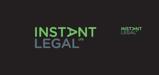
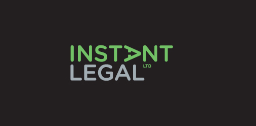
I was hoping to get some feedback on this logo for a web based legal services provider.

Specifically - whether the rotated A breaks the wordmark too much, and any thoughts regarding the spacing, negative arrow. Or anything else that comes to mind for that matter.

Thanks in advance.
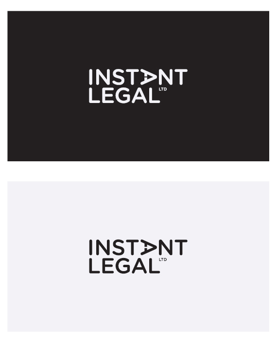
As soon as i saw this i read 'ILEGAL' - which i imagine is undesirable. I suspect that this is either because of the IL alignment or the rotated A breaking the instant into INST which my mind then dismisses as a non-word.

Wil

Thanks Wil. illegal is not good. I considered using a lowercase i which helped with that issue - maybe I'll have another look.

I find the sideways A distracting. Basically I look at that, wondering what it is, and I don't read the rest. I see the arrow, but I also see a stapler, hole punch and a bulldog clip, plus an arrow doesn't mean "instant" to me.

I find the sideways A distracting. Basically I look at that, wondering what it is, and I don't read the rest. I see the arrow, but I also see a stapler, hole punch and a bulldog clip, plus an arrow doesn't mean "instant" to me.

I don’t dislike it. The "arrow inside A" isn’t so unique, but the only thing that really bothers me is the round type.

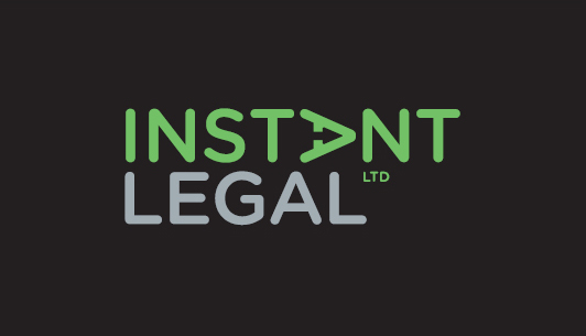
Thanks for the feedback so far. The round typeface is a stated preference of the client, who wants something vaguely informal/relaxed/web2.0-ish. This is the colour palette I'm leaning towards (pretty obvious, but green for instant - something more serious for legal). Cheers.

Purely aesthetically, the tiny stem of the arrow in the A bothers me - it's very thin compared to the rest of the counter space. Have you considered removing the crossbar entirely, for an even more web-2.0-ey play button effect?

Also, does the "LTD" have to be there?

I'm pretty sure the LTD will have to be there, at least somewhere. The arrow stem is quite narrow - more so on the reversed version. Will look at that. Cheers.

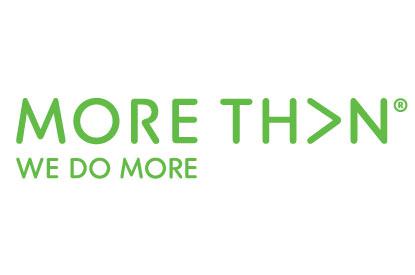
slight update based on Birdseeding's comment. Removing the crossbar completely makes it look too much like the morethan logo, if you know what that looks like. Now that I've thought about morethan it won't go away.

Better! You might want to do separate versions for positive and negative space that optically look the same, that's how the big agencies do it.

Still unsure about the arrow stem, it's the sharp edges (as opposed to the soft ones elsewhere) that bother my eyes a bit too, and it's still narrower than the aperture of the G and S. Not sure anything sensible can be done about that, except possibly move the crossbar down (ie. left) a bit and widening the gap even more. Or removing the gap altogether, it can still be an arrow I guess. Not convinced either will work. :)

The arrow is a clever idea, but it's rather tiny and at first I just read it as an odd, sidewise A.

Maybe if there was a way to make the arrow more prominent, like doing it in a different color or something.

Another tweak - slightly rounded arrow points, as suggested above.

Have you tried making the arrow white, or maybe the same gray as "legal"?

why not leave the A upright? You can still have the arrow. Im not sure a right point arrow says "instant" anymore than an upward point arrow does.

Or maybe just the arrow head pointing right inside the upright A. It would look different enough to notice but not so different it stops looking like an "A".

It does feel kind of been-there-done-that, but what about putting the A upright and making the crossbar into the arrow, pushing the tip out toward the N?

http://www.studiobotes.com/illustration/adventures-with-a/09.jpg
http://logopond.com/gallery/detail/119867
http://logopond.com/gallery/detail/119879
http://logopond.com/gallery/detail/125659

Does anybody else think that the resemblence to the MoreThan logo is an issue?

Personally I think the logo is too similar. While their brand is not as well known as some marks people will still think ”More Than“.

Very similar (even rounded sans fonts), but MORE THAN is better executed in my opinion.

Captured from commoncrawl.org on 19 Apr 2015. original URL