Hey,
I'm a production designer who's involved in designing an event taking place in the mid to late 18th century, and I need to use some fonts from back then. You people around here are always so skilled, I'm sure somebody can help me out?
Hey,
I'm a production designer who's involved in designing an event taking place in the mid to late 18th century, and I need to use some fonts from back then. You people around here are always so skilled, I'm sure somebody can help me out?

Where? I think during the 1700's it's going to matter where you are shooting for, so to best answer the OP, I'd want to ask where do you want it to look like during the 18th century? ex: people in italy had different lettering needs than people in germany, and they were incredibly isolated, so their printing "fonts" were thick in mimicry but lack hybridization. (language> usage>design elements to consider)
Otherwise, something blackletter to some sort of double stroked calligraphic I'd imagine would be convincing, like some sort of 'Ye Olde' truetype.
Or, you're going Latin.
Oh, I see. I, of course, being an amateur in this field, didn't think it was this complex, haha. Let's say I'm loosely aiming for central Europe... If you need something more specified, let's say France and/or Great Brittain. And oh, I'm looking for some sort of "printed" font, not a calligraphy one (I'll probably just write those parts myself).
Thanks a lot!

Short answer: on the Continent, Bodoni; in the UK, Caslon...
thank you sooo much! very helpful for a book I wrote and currently Kindlizing z-z-z-z, All Blood Runs Red, about America's first black military pilot, Eugene Bullard.
Frank Sanello
I'll take that for an answer, thank you very much!
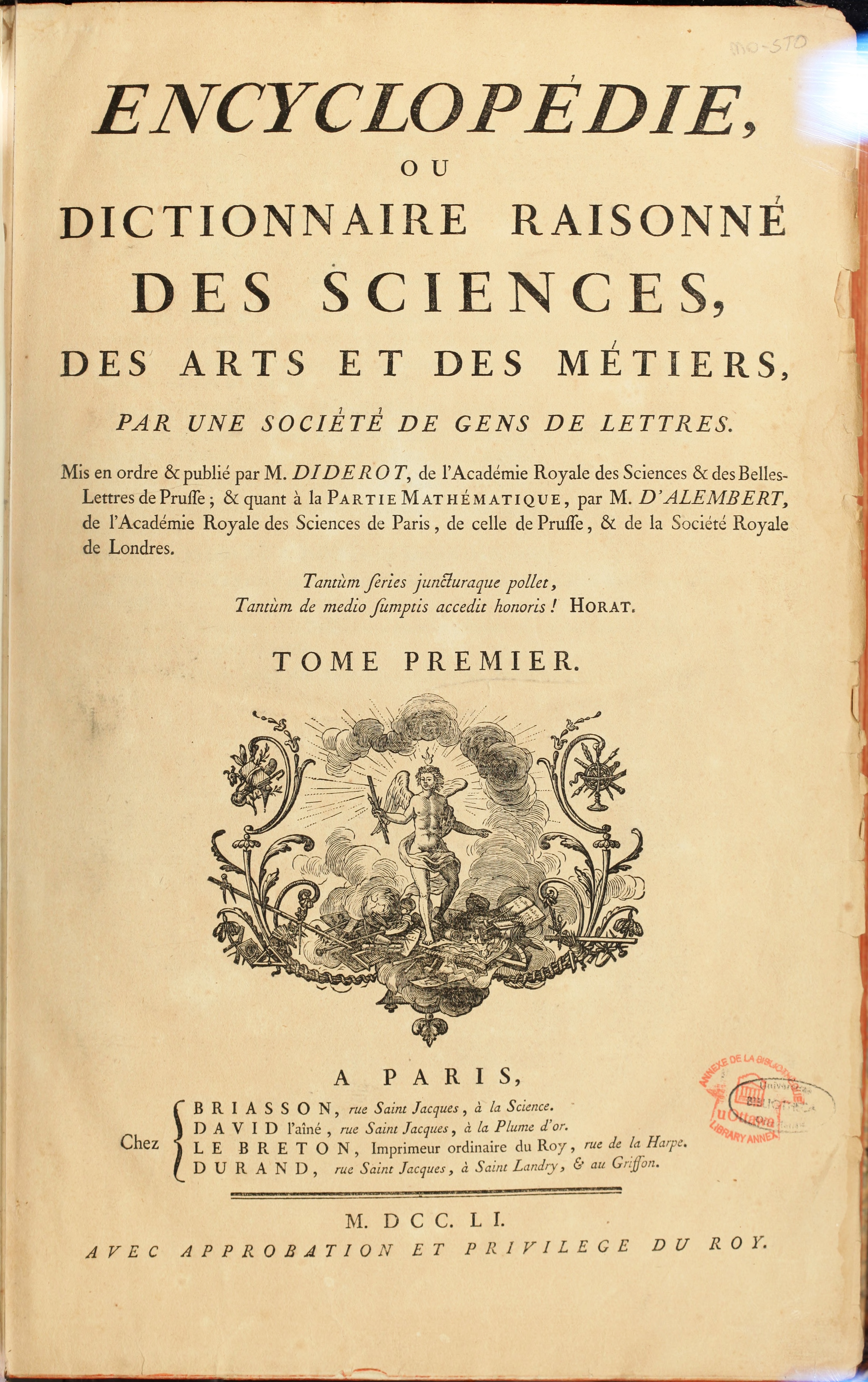
And, oh, while on the subject, could anybody identify this/these font/s for me? It doesn't happend to be Bodoni or Caslon, does it?
http://upload.wikimedia.org/wikipedia/commons/8/8e/ENC_1-NA5_600px.jpeg

I know this sounds like I am nit-picking…
But France and UK are definitely not “Central Europe”. I would say that term discribes the area from Germany, Poland, Austria, Hungary, Czech Rep., Slovakia, northern Balkan, maybe western parts of Belarus, Ukraine, Romania.
There terms are anyhow socially constructed, as is the whole concept of Europe itself. Which is why I see it as even more important to include former Warsaw-Pact countries, to shape a new European understanding, which adopts the new integrated reality.
The style of Fournier could be interesting
http://new.myfonts.com/fonts/adobe/fournier-mt/
while on the subject, could anybody identify this/these font/s for me? It doesn't happend to be Bodoni or Caslon, does it?
The shapes of the C and the a suggest a variant of Garamond...

A Redtail? But the guy in the photograph doesn't look like a Black pilot ...
Even if he was the first, this, from the brief
.. an event taking place in the mid to late 18th century ..
predates the Wright bro's. Perhaps your guy flew a balloon?

You say you are "designing an event taking place in the mid to late 18th century and I need to use some fonts from back then." Any signs would have been hand lettered in a wide variety of styles. Printed material, books, handbills, newspapers would have used type. We are talking about type with serifs, not sans-serif. 18th century printed pages may look lighter, i.e. less black compared to white, than 19th & 20th century pages. In the mid 18th century it's too early to use "modern" i.e. high contrast faces such as Didot or Bodoni. Printer's had a large stock of "old style" faces, which varied by country. Something like Adobe Garamond would work for most countries in the 18th century. Typefaces that we now classify as "transitional" or "baroque" are are good for representing the Enlightenment movement. Consider Plantin, everywhere, and for England, Caslon and Baskerville. Fleischman's Dutch designs were widely imitated in most countries during the last quarter of the 18th century. Bodoni light to medium weights can be used for fashionable texts from the 1780's onward. Revolutionary France can use Didot. For text in Germany and Germanic influenced areas of central and eastern Europe, Fraktur for politics and popular texts, "Antiqua" i.e. the serifed Roman types, was used for scientific papers.
BTW this is written on the fly. It's not the word of God.
Good luck with your project.
Don
Captured from web.archive.org on 4 Oct 2019. view this capture