
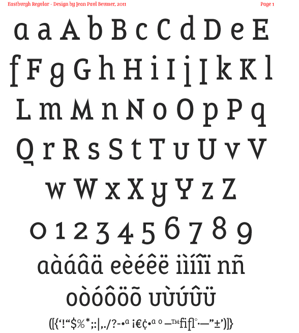
Since working on Aubaine and New Dutch Sans (which are still not finished), I've had some new ideas. Eastburgh is one of them. Please comment!
| Attachment | Size |
|---|---|
| Eastburgh_proof_22feb11.pdf | 273.47 KB |
| Eastburgh Regular and Italic Proof.pdf | 19.32 KB |
Since working on Aubaine and New Dutch Sans (which are still not finished), I've had some new ideas. Eastburgh is one of them. Please comment!
| Attachment | Size |
|---|---|
| Eastburgh_proof_22feb11.pdf | 273.47 KB |
| Eastburgh Regular and Italic Proof.pdf | 19.32 KB |

not bad at all!!!
not my favorite type of typeface (in terms of aesthetics), but it is very solid and the small caps work really nice!
good work!

It's very distinctive. I'm getting an Emigre vibe from some of it. I don't get the straight /J/. If you cut the serif off the right side, sure, but... It that a regional convention somewhere? I think the /j/ works alright, though it's still a bit strange.
The color seems consistent, except that /M/N/W/ appear a little bit heavy in text (just assuming on the W since I couldn't find any in the test paragraphs.
I find double /f/s to be distracting in text (on page 4, my eye is drawn straight to "souffle" and "effet"). Maybe you should make it a ligature with one of them on the baseline. Having single /f/s go to the descender line is fine.
The last little thing I see is that /%/ looks light.
It looks great though, overall. I could definitely see using it.
Thanks Andrej and Tristan! Nice to get positive feedback!
Perhaps not to everybody's taste, but hey, you can't please them all!
There's no convention on /J/, it's just me ;-) Although it sticks out, it sticks out if you know what I mean. Not sure I want to change that.
I'll take another look at /M/N/V/W/, lighten them up a bit (and put them in some text).
I'll also make a ligture for ff, I've already got some ideas. /%/ and other less used glyphs like it need some more attention anyway.
Thanks again, I'll update soon.
Mmmmyeah. I don't know that the /J/ "sticks out" so much as masquerades as another glyph.
you can say, it is you, but you also can say that /J/ sticks out just so much, that the majority of people might not buy/use the typeface just because of that. ;)

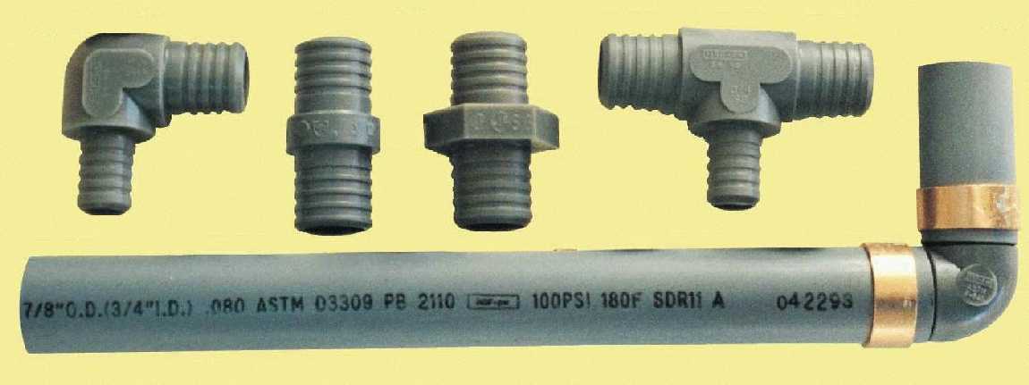
Nice idea - reminds of the quirky, industrial curves of plumber's piping.
If this is meant to be a display typeface, why show it at such small text sizes? Show how it would really shine - magazines, headlines, logotypes, whatever you think.
Eastburgh has been released by MyFonts.com here.
Please check out the design for the ultrablack weight (caps only for now).


very nice!
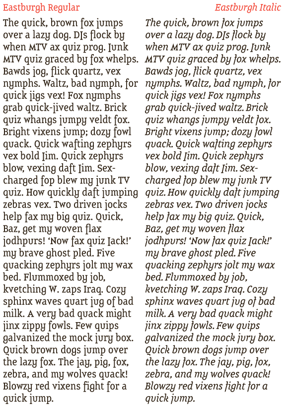
Working on the italic as well, please check it out (see also PDF above)!

Very cool.
Thanks Ray!
true about the j tho.
Captured from web.archive.org on 23 Apr 2015. view this capture