
Compiling a list of modern monospaced fonts. Trying to find the newest, and slowly work backwards.
Univers® Next 430 Typewriter Regular made my jaw drop. I’m guessing it’s >2009 as it’s not on Wikipedia’s list of Adrian Frutiger’s typefaces.
Compiling a list of modern monospaced fonts. Trying to find the newest, and slowly work backwards.
Univers® Next 430 Typewriter Regular made my jaw drop. I’m guessing it’s >2009 as it’s not on Wikipedia’s list of Adrian Frutiger’s typefaces.
And as I write this I notice the featured face is Alix FB. However, I cannot find a date for this.
For the thread, this is strictly a fun personal project (avoidance behaviour).

As far as i recall, the Univers Typewriter dates from the early 90’s when it came along with the formerly named ›Linotype Univers‹ revised edition. (Univers Next is just an updated name for the new Univers.)

Alix is new this week.

Consolas

Inconsolata, Anonymous.
@ Berlow, Duggan & Sartori: Do you have dates for these?
@ Welton: Thanks for the Next info. I was wondering what that was all about.

FB Alix is dated 2011 on the "Typography for Lawyers" site, pretty much its home site.
Monospaced fonts at hand on my box (year is earliest found in file):
Anonymous Pro (2009)
Bitstream Vera Sans Mono (2003)
CBM-64 (1997)
CPMono_v07 (2006)
Deka (2010)
Droid Sans Mono (2007)
Envy Code (2006)
Erica Type (2010)
Fixedsys Excelsior (2007)
IBM Courier (1990) - gunna bottom out your list.
Inconsolata (2006)
Liberation Mono (2007)
monofur (2000)
NotCourier Sans (2008)
ProggyCleanTT (2004)
RursusCompactMono (2010?)
saxMono (1999)
Share-TechMono (2005)
String Literal (2005)
SV Basic manual (2004)

Panoptica (2003)

Andalé Mono, which is used, I think, in the logo of The Early Show on CBS, with aggressive kerning around the lower case l.
http://myfonts.us/td-IwWxBc (searched "monospace" with design date after 2000)
Also, do you count derivatives, like Menlo?
@Nick: An impressive family. Have you ever had call for setting long passages in Panoptica? If so, do you have any screen shots? I am also curious as to the genesis of this design.
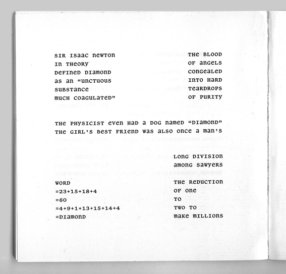
The Panoptic alphabet (unicase + monowidth) was created for a certain kind of constraints-based concrete poetry, in particular Diamonds by Christian Bök. Here's a page:
"@ Berlow,: Do you have dates for these? "
I don't believe fonts should date their first year of release. They're just too young to make well-informed decisions.

There is also Neue Sardines from VetteLetters, which is monowidth and monoheight.
@Té Rowan: Impressive. Can you do that backwards starting with oldest? That might be a Shinn or Berlow question too. And I just extracted the dates joke you made. Well put. It’s been a rough week, thanks for the smile.
This listing is in passwd format.
1. Earliest date, believed or known.
2. Name of face/font and version I have.
3. Age of the version I have (file stamp).
4. Comments, sarcasm and half-wit
1987:Bitstream Courier:1992-04-25:
1990:Courier New v2.90:2001-08-18:
1990:IBM Courier v001.003:2000-08-30:The X11 loaner.
1990:Courier 10 BT mfgpctt-v4.4:1998-12-10:
1990:Letter Gothic 12 BT mfgpctt-v4.4:1998-12-22:
1990:Prestige 12 BT mfgpctt-v4.4:1998-12-22:
1992:Monospaced v001.003:1992-10-31:Corel's Letter Gothic
1992:ElroNet Monospace v1.0:1995-04-23:
1993:Andale Mono v2.0:1998-11-12:
1994-11-15:AnonymousTT v1.3:2005-03-22:
1995-10-03:Crystal v5.1:1999-03-25:
1996-06-02:Everson Mono Latin 6 v1.1:2007-02-09:
1997-11-27:CBM-64 v1.0:1997-11-29:
1999:History Happens v2.00:2002-08-30:
1999:LCD Mono v1.0:1999-10-30
1999:Nimbus Mono L v1.05:1999-12-29:In the gs600 fontpack.
1999:saxMono v1.10:2009-01-16:
1999-03-10:Ericsson GA628:1999-03-10:I miss my '628.
2000-03-28:monofur v1.0:2000-05-05:
2001:Luxi Mono v1.2:2002-01-24:
2001:ModeNine:2001-03-19:
2002:HPGCalc v004.000:2002-10-31:
2003-05-07:Crisp:2004-07-31:
2004:Cubi:2004-07-29:by Warp3
2004:F25 Telegraphem v1.000:2009-08-06:All-UC.
2004:SV Basic Manual v1.00:2007-09-07:
2004-04-15:PixelCarnageMono:2004-12-30:
2004-04-15:ProggyClean:2005-03-17:
2005:AUdimat Mono v1.0:2005-10-13:
2005:Metro:2005-09-07:by Warp3
2005:Share-TechMono v1.000:2005-10-31:
2005:String Literal v0.60:2005-12-22:
2005-08-26:Inconsolata-dz v001.010:2009-02-12
2006:F25 BlackletterTypewriter v1.000:2009-08-06:
2006:F25 Daisywheel v1.001:2009-08-06:
2006:Envy Code R v0.079:2008-05-26:
2006:Verily Serif Mono:2006-07-23:
2007:Aurulent Sans Mono:2009-01-16:
2007:BPmono v1.000:2008-01-19:
2007:Droid Sans Mono v1.00.112:2009-03-30:
2007:Fixedsys Excelsior v3.01:2009-03-01:Download date.
2007:F25 TypewriterCondensed v1.000:2009-08-06:
2007:Liberation Mono v1.06:2010-07-21:
2007-04-20:tt-kp:2007-07-25:
2007-12-20:Rursus Compact Mono:2010-04-12:
2008:NotCourier-Sans v1.1:2009-05-15:
2009:CPMono_v07:2009-08-07:
2009:monoMMM_5:2010-01-27:
2009-07-10:Anonymous Pro v1.002.001:2010-09-08:
2010:Anka/Coder v001.000:2010-03-12:
2010:Bowman v1.000:2010-03-30:
2010:Camcorder Monospaced v2.000:2010-01-11:
2010:Cousine v1.00:2010-08-09:
2010:Deka v20100322:2010-04-02:
Not a perfect list by any means, since it only shows what I have, and not even all of that, either. I'm yet to sort through the Manfred Klein accumulation (not gunna dignify my 'acquisitions' with a word like "collection" - let alone "library").

I am not sure of the dates, though…
By the way, here you can find information on the old Soviet industrial standard (GOST) on Cyrillic OCR type design: GOST 16330-85, Information processing systems. Founts for optical character recognition. Types, basic parameters and dimensions. The 16330-85 was an update of an earlier standard, 16330-70 (the last two digits in the number stood for the year of adoption). The expiration date of that new standard was July 1, 1991. Those ROS-A and ROS-B types looked pretty scary.
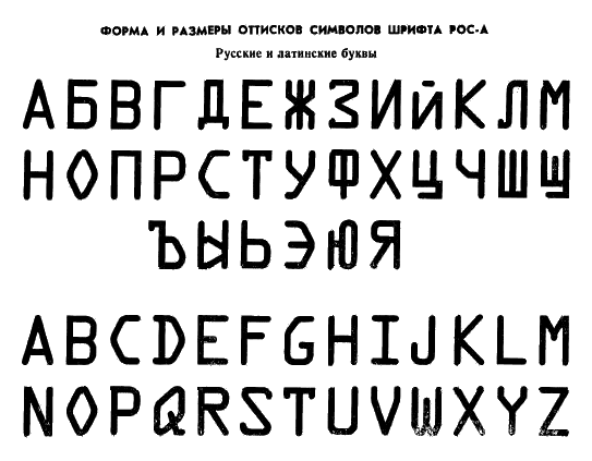

No, no he wanted MODERN monospace fonts. Here's one:
Thanks for the link Birdseeding .
Towards the middle I said “@Té Rowan: Impressive. Can you do that backwards starting with oldest? That might be a Shinn or Berlow question too…” Looks like were talking about all ages at this point. Which is even better. For some strange reason I find myself strangely fascinated by mono-spaced fonts. I think it’s a math/I’m reading old type-written manuscripts thing.
The more the merrier.
Programmers use them a whole lot, too, so there is still refining going on.
@Té: Programmers. Good one. I’m particularly fond of monospaced fonts that have dots or slashes on the zero’s so they can't be confused with capital O’s. Without looking, how many can you name? Then you can cheat.
Without looking: Monaco (slash), Andale Mono (dot), Anonimous (slash). One feature I find interesting (and would like to see often) in some monospaced typefaces is that slashed zero sports a backslash, to further differentiate from Ø.
Related question: are license plate typefaces generally monospaced?
Without looking, I think yes. However, seizures ≠ driving, so I’m probably the least informed person to ask. I’ll start looking tomorrow though, and probably for the rest of my life now. Thanks for that.
Without looking I can name one, Consolas.
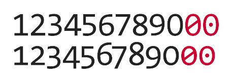
Er, my last link was a joke, sorry about that, I spent ages looking for a monospaced font in the "Modern" category with Didones and stuff. (Might be a space in the market there!)
Fixedsys (and I guess Excelcior) has a 0 with a clear distinction from the O, though it's done with little inside curves rather than lines or dots. Also, the 1, I, l distinction is an important one for programmers.
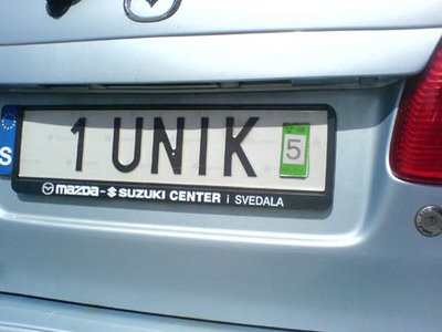
Here's a Swedish vanity licence plate with a non-monospaced font, so at least it's not universal:
Right off the top of my head I can recall dotted and slashed variants of Droid Sans Mono.
http://www.leewardpro.com/articles/licplatefonts/licplate-fonts-intro.html looks to me to be a good intro/reference to licence plate typography.
Aside: Current Icelandic plates are made with what looks to me as Helvetica. As far as I can recall, the previous series was also stamped with a proportional font. In my memory, it was a DIN variant, but in RL it's not.

Capibara Mono:
http://www.boldmonday.com/en/capibara_overview
Pieter

Don't forget about all those http://www.lineto.com monospaced beautys. I'd wager they have more monospaced than proportional fonts in their library.

A few more I haven't seen mentioned...
Orator - Adobe, 1987; John Scheppler, 1962
Monaco - Kris Holmes and Charles Bigelow, 1990; Susan Kare, 1983 (bitmap)
TheSans Mono - Luc(as) de Groot, 1994
TheMix Mono - Luc(as) de Groot, 1996
Thordis Sans Mono - Carlo Krüger and Günther Flake, 1997
OCRJ and OCRK - Joe Kral, 1998
Lucida Mono - Kris Holmes, 1998
Quadraat Sans Mono - Fred Smeijers, 2000
Fago Monospaced - Ole Schäfer, 2000
Eureka Mono - Peter Biľak, 2001
Fedra Mono - Peter Biľak, 2002
PTL Manual Mono - Ole Schäfer, 2002
Nexus Typewriter - Martin Majoor, 2004
Linefeed - Ray Larabie, 2005
Ascender Sans Mono - Steve Matteson, 2005
Botanika Mono - Tomáš Brousil, 2007
OliveGreen Mono - Georg Seifert, 2007

FB Aix has a slashed zero as an OT alternate (IIRC there's a special substitution tag for that). It's a slightly trickier problem than one might suspect — adding the slash or dot starts to make the zero look like the figure eight at small sizes.
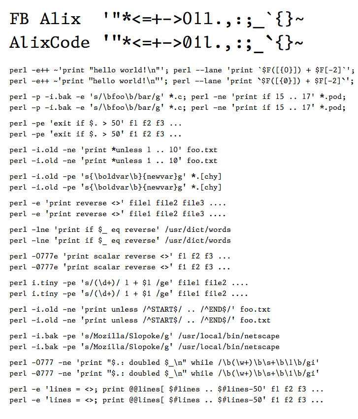
I developed a set of alternates for Alix optimized for programming, but they didn't make it into the retail release.

@butterick
FB Alix looks very nice! What sort of alternates did you develop for programming? Was it just for the 0? I'm curious what you did.
Best wishes,
Stephen
What sort of alternates did you develop for programming?
The zero, one, and lowercase L are different. I also changed the color & alignment of a few other characters to improve their appearance at small sizes, and make them relate to each other according to their programming meaning.
Note that other than the slashed zero, these characters are NOT available in the retail version of FB Alix.
Before I forget it yet again... Ray Larabie has made a few monospaced fonts, notably Larabiefont, Minisystems and Monofonto, all from ca. 2000. David F. Nalle made Onuava ca. 1998.
@butterick
AlixCode is really nice---those are thoughtful changes for programming. It's too bad that it's not currently released. Do you think that will change in the future?
Thanks for sharing!
Stephen
Do you think that will change in the future?
As with most things in type, it will depend on 1) sales, 2) public outcry, and 3) sales.

Hello,
there has been a Univers Monospace version used for binary data-treatment within the 1972 Olympics.
I don't know who made it. Maybe some engineer… But it's looking quite good.
More information here:
http://www.youtube.com/watch?v=tll5Q-Rkilw
I'm just working on abook about the item
http://www.youtube.com/watch?v=cI-uZnXRQs4
Absolutely fantastic links. I look forward to your results.

> I don't know who made it.
Maybe Aicher?
hhp
It's possible that he has been involved but it's not mentioned anywhere. The only sure thing is the use of the font in this context. I will check the Siemens people.
Thanks for the positive response…
I just noticed this funky thing!
http://www.myfonts.com/fonts/mti/unotype/
BTW it's strange how its preview on MyFonts is shown in Optima...
http://www.myfonts.com/person/Bo_Berndal
hhp
Anonymus Pro
Designed for on-screen use by coders.
Ubuntu font family
Open source. Has a monospaced version.
Loads of Couriers
A Typophile thread (2013)

Tabac Mono, 2012
https://www.suitcasetype.com/tabac-mono/specimen
Captured from commoncrawl.org on 19 Apr 2015. original URL

