
Logo I'm creating for a webhoster. Core values: honest communications and outstanding service.
I would very much appreciate your feedback on letter construction and kerning. :-)
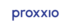
Logo I'm creating for a webhoster. Core values: honest communications and outstanding service.
I would very much appreciate your feedback on letter construction and kerning. :-)
The xx could be a little tighter, but overall it's a little dull; like a horizontal stripe. Maybe you could do something interesting with the xx or with the i.
The idea below popped into my head for some reason...

r seems unbalanced. Maybe you could shorten the "faucet" (also its terminal angle doesn’t match any other).
Thanks guys.
@riccard0 The upper curve of the facet is the exact curve of the o. The lower curve is adjusted. I will play with it a little more.
@ JamesM I will tighten the xx just a little bit more. Thanks for your suggestion but i think I will go for an additional mark in front of the wordmark. If you have any suggestions??
What do you guys think of shorten the p just a little bit and maybe making it look a little bit lighter by playing with the o bit?
> Think I will go for an additional mark in front
> of the wordmark. If you have any suggestions??
My suggestion would be to research the logos of their competitors (both for inspiration and also to avoid accidental duplication), and then spend a whole bunch of time coming up with concepts that communicate the company's qualities and goals and also differentiates it from the competition.
About the r, I meant the angle at which the curve is cut, not the curve itself.

Yeah, the r is definitely off. It should not be based on o's curves.
Yeah I see what you mean riccard0. I will work on all your feedback.
Meanwhile here is something else. Font kerned by hand. What do you think?
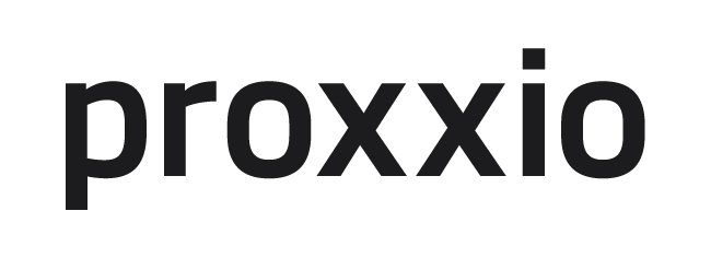

That last one is much better. Still a bit dull though. I think that for the company you're design for a more personal/open look would work better.
Something about the curves of P and R that don't match the "webhoster". Looks more like an e-commerce shopping card provider or an accounting service. Some business that is naturally boring trying to look modern and more interesting than it is. I can't really quantify it though, just a subjective impression.
Captured from web.archive.org on 5 Aug 2014. view this capture