Hello everybody,
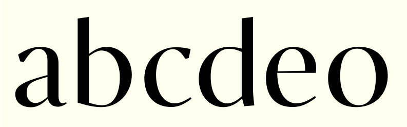
I've been working on Sensato Display, which I assumed would be great for fashion design. However, when I compared it to Didot the contrast turned out to be rather mild. Underneath is are the first few glyphs from a version of Sensato with really high contrast. I don't know of any sans-serif with such a high contrast and I don't feel like it lacks serifs (That's what I expected to see), so I'm pretty happy with it so far. Although it's just a few glyphs, I hope you are able to judge it's potential. Any feedback is much appreciated.
Cheers, Jasper