People keep asking me to translate my essays and talks about legibility into English. The translations and definitions of legibility and readability are fairly easy, but I use some addition terms in German, which I am not so sure about.
This is my theoretic legibility model:
Legibility is defined by properties of the layout (->typography) and by properties of the used typeface. And here I use three German terms which I need to translate:
German: Erkennbarkeit
Direct translation: recognizability - the characteristic of a letter to be perceived as such. Recognizability is probably okay, isn't it?
German: Unterscheidbarkeit
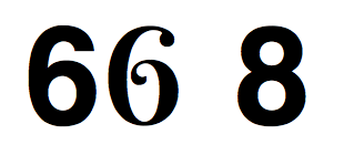
Direct translation: distinguishability - The characteristic of a letter to be easily told apart from other letters. For example one-storey a vs. two-storey a.
“Distinguishability” seems to be used rarely. Is it okay or is there a better word for that?
German: Lesefreundlichkeit
Direct translation: reader-friendliness
This is probably the most tricky one. It describes the characteristic of a typeface to be readable in continuous texts without causing the reader to get tired or distracted. One typeface might be perfectly legible (in terms of recognizability/distinguishability) for a single shopping mall sign but it might still not be suited for a 400-page novel.
Is there a good term to describe this feature of a typeface? Or does the “reader-friendliness of a typeface” make any sense to a native English speaker?