Hello
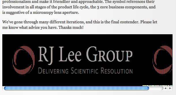
First post here, I've been a long-time silent reader of these forums and I've always been impressed with the insightful, helpful critiques offered. So now I’d appreciate some feedback on the attached logo.
The company is an analytical laboratory, dealing with a large variety of materials characterization, field services, consulting and litigation support, and most recently software design (really they’re all over the place).
They wanted to simplify and refresh their previous logo, but still retain a level of professionalism and make it friendlier and approachable. The symbol references their involvement in all stages of the product life cycle, the 3 core business components, and is suggestive of a microscopy lens aperture.
We've gone through many different iterations, and this is the final contender. Please let me know what advice you have. Thanks much!

| Attachment | Size |
|---|---|
| RJLG_Logo_020711.jpg | 598.65 KB |