Typophile

What typeface did you use on your CV?

RadioB

i think its really interesting to know what typeface designers use on their CV, it's almost like asking what typeface are you?

I use Adobe Caslon in mine.

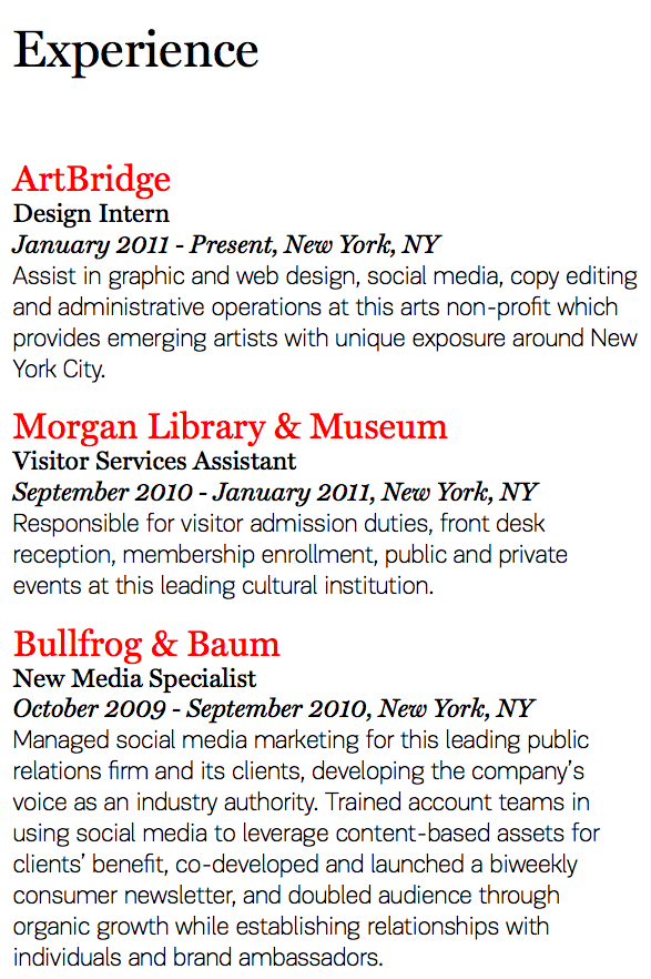
I was asked to redesign a CV for a friend(a very interesting project by the way, it was actually quite difficult and very fun), and I thought of using Officina because she works in a bank and I expect her cv will always be printed on some cheap laser printer, I think Officina looks good no matter how cheap the printer is.

what about you?

Baby Teeth for me every time.

Gill Sans for headers, Cultura for body copy.

That said, these days, unless you are specifically applying for a graphic design job, i think all resumes end up being ugly Arial and Times .doc files.

baby teeth is a great typeface

Comic Sans for headers and all-caps Arial bold for body copy with really tight leading. Numbers get Papyrus for a bit of "authentic historical flavor".

In all seriousness, I actually haven't needed one yet, but off the top of my head, maybe Frutiger family for headers and a Garamond for body copy?

http://new.myfonts.com/fonts/berthold/laudatio-be/regular/

very legible, an unobtrusive large x-height, and inconspicuously condensed...

I am a fan of humanistic sans, which I find maybe for most of designers here already a bit dated, but in a non-designer environment still a fresh appearance. Therefore I make us of Frutiger. The MS rip-off “Segoe UI” is sufficient too. The new Office font Calibri is too “bundled” and round. Most people I know use Arial.
As a serif font I read the recommendations of Georgia, Palatino and especially for conservative business Century Schoolbook.
Personally I find with a serif, it should not be too decorative and I prefere a large x-height, as a size of 10 point (not smaller than 9 I would say) should still be readable. Good candidates to fit this brief are in my opinion Droid Serif and Utopia.

I've used Plantin. Plain, clear, not ugly.

Last time I used Thesans.

I went a bit different and paired Dolly with Stag Sans Rounded with plenty of leading for the body.

Miller and PF Encore Sans! Fairly untraditional swap of sans and serif, but it works really nicely.

None, I never wrote a CV.

Palatino, but it was 5 years ago and I am not a designer :)

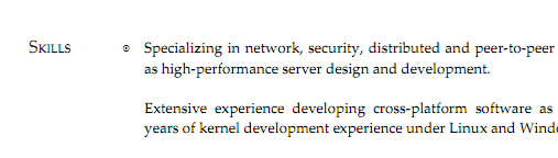
Skolar — anyone hiring in the London area? :)

Ooh, Skolar works very nicely!

One problem I have often run into is when s/he want’s to update it themselves in the future when I’m not around and they don’t have your fonts or software. It’s possible to pull it using Times and Arial in Word. It's not the font, it’s how you use it. While presentation counts and you want a salient typographic hierarchy that is congruent with the informational hierarchy, there is a law of diminishing returns when it comes to pushing type around on a page for a document such as a CV. At the end of the day, content is more important than form. < /soap_box >

Yes Christopher the content is more important than the form, I agree, but if you can, why not have the best of both worlds? Obviously the fact that I designed her CV is not going to get her a job she is not qualified for, but I like to think that having a well designed CV with perfect typography would help in someway, but at the end of the day I'm a graphic designer so I might be a little biased.

I started using Skolar for papers at school and have been dissapointed - using it in MS Word it seems to be too dark/heavy. I really love the shapes of the letters (apart from the lower case "a") but wish it was a little lighter.

Never wrote, but I shall definitely do it in Brushscript.
I suppose it looks very businesslike. I already started to collect samples of use of Brushscript in the business environment and I can prove that it is utilized at least twice as many as Helvetica. There will be a section of "Logos by a Secretary created of Brushscript".
Perhaps this is the type films should be made about.

@Bendy – Thanks, yeah I've loved using it.

@forrest – Would it still look dark when you printed it out? I find it to be pretty well balanced.

Never had to do a resumé yet. The last job I got just required filling out a form with that same information.

Fresco by Fred Smeijers (OurType).

Never had to do a CV yet, but if I did, it would have to be in some font that lawyers like. I'll find out what that is when my copy of 'Typography for Lawyers' http://www.typographyforlawyers.com/

arrives in the post in the next week or two.

Kris Sowerby’s National... Although, I wish there was a condensed version available (even a monospaced variant would be useful).

Mike Diaz :-)

Captured from web.archive.org on 20 Aug 2013. view this capture