
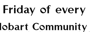
G'day guys -- I'm guessing this is a free font based on something fairly mainstream but they've wobbled the o to make a point of difference.
G'day guys -- I'm guessing this is a free font based on something fairly mainstream but they've wobbled the o to make a point of difference.
Perfect thank you very much!
Captured from commoncrawl.org on 27 Apr 2015. original URL
