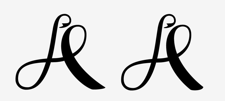
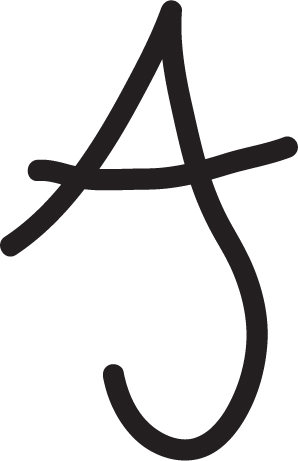
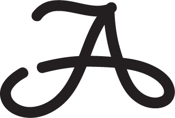
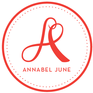
In lieu of giving a full description for the project, I'd like to say only that the client name is Annabel June. I'm curious to see how this logo is being interpreted, and if it is translating the way it should.
thanks!
| Attachment | Size |
|---|---|
| Screen shot 2011-02-14 at 10.15.35 AM.png | 29.71 KB |