Hey everybody,
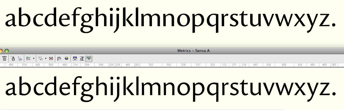
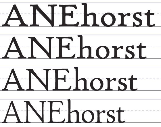
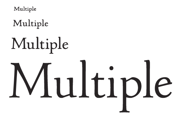
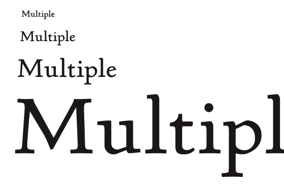
During the designprocess of Sensato I realised I just couldn't decide upon which contrast to use. After some troublesome nights (I'm not obsessed with typedesign at all ;-P) I decided to just make a MM file and try out some different contrasts. Takes a while, but worth it, I figured. Underneath shows the three variants I came up with, from high to low contrast. Obviously the high-contrast one has some troublespots (the other ones were already there) but you should be able to get the picture. However, I came up with the following. If I design the two extremes I could make the in-between using MM easily, which creates something like optical weights. I could name them Sensato A - C, each letter (A-C) representing a different contrast. I would like to know what you think of the idea and if you have any critique on the design itself, that is always much appreciated.
Cheers, Jasper