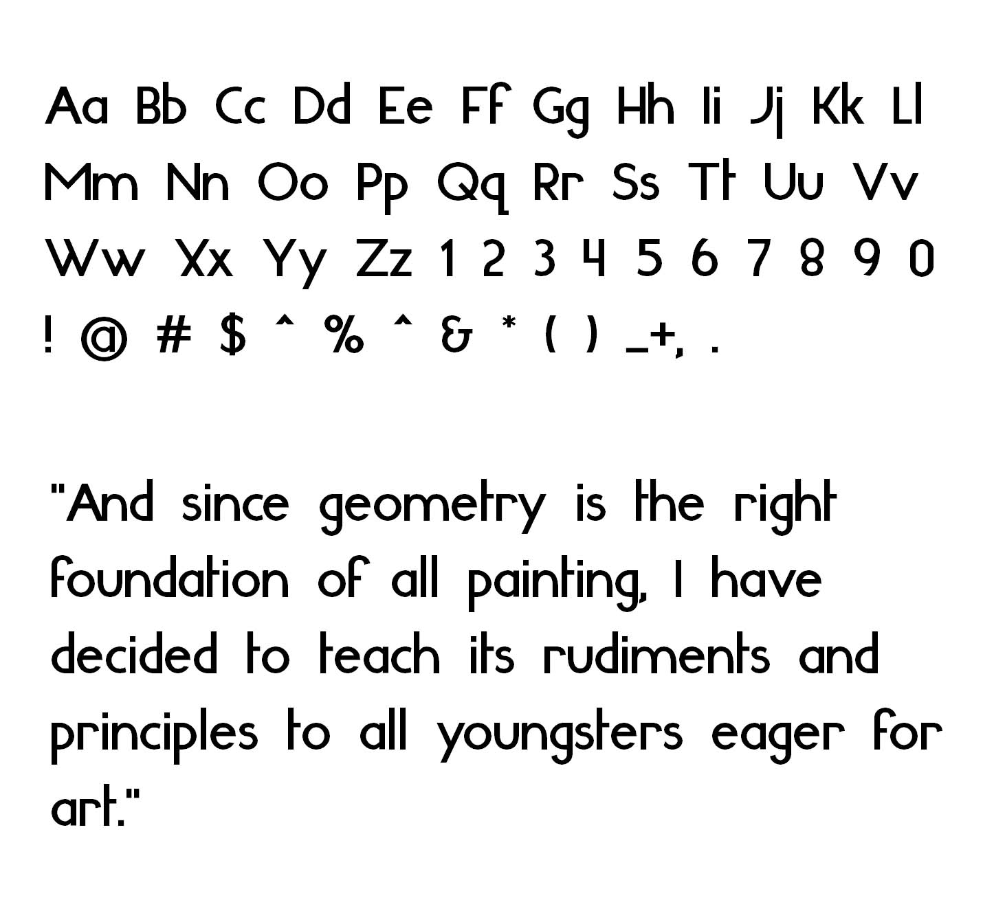
Here is my new geometric sans serif typeface. It is called "Smallstep".
I am posting it to see what do you think about it, so feel free to share your opinion with me and the rest of the forum viewers.
| Attachment | Size |
|---|---|
| smallstep.jpg | 166.35 KB |
Here is my new geometric sans serif typeface. It is called "Smallstep".
I am posting it to see what do you think about it, so feel free to share your opinion with me and the rest of the forum viewers.
| Attachment | Size |
|---|---|
| smallstep.jpg | 166.35 KB |

over all look is kind of quirky, you have to keep the same weight for all characters.
A is definatelly too bold, comparing with others.
m, n = they need a bit more fixing.
that's it for the beginning.
you are quite right about A
m, n I'll probably play with them some more.
the shoulders of m, n definatelly need some fixing, thats for sure.
Changed them.
Here is the result:

i think you stick too much to the geometry, which is not really helpfull here.
besides that, it's hard to see how characters really look like, without an pdf.
You really think so? Geometric standarts are in the backbone of this design and I dont see where I will be going without following them. Still if you mean something specific I am willing to try it :)
And you are right about the pdf:
well, there is nothing wrong with that if you use geometry as a fondation for your face.
in my opinion you have to make some compromises to make it more interesting, legible and sexy, after all.
just sticking to the geometry for the sake of it wont make your face more interesting.
but then, maybe it is just me. :)
Maybe you are right... I'll try to make pq and g look more like mnh
like this:

I am not sure which is better...

It might just be me, but there's something awkward and unstable about the whole font. A few things I'm noticing:
1. /s/ looks like it's leaning to the left
2. /e/ looks like it's leaning to the right when next to certain letters
3. /t/ leaning to the right
4. terminals of several letters appear too wide and "chunky" (maybe that's what you're going for though)
5. Shoulders of /n/ and /m/ appear to slope too sharply
I'm no type designer, so take my advice with a grain of salt, unless some more credible reinforcement comes along.
I'll take your advice on the s.
I cant see what you mean by e and t and terminals look that way on puprose.

Have a look at this post, you may find it very useful
http://typographica.org/2010/on-typography/making-geometric-type-work/
seen it.
Captured from commoncrawl.org on 19 Apr 2015. original URL