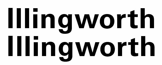
I am typesetting business cards and have come across a small problem. A person's name is Illingworth, and they specifically requested an "I" with serifs so one can differentiate it from the double L that follows. How would you go about doing this?
- I tried leaving it in Univers and just adjusting the kerning between the I and double L.
- I reluctantly tried reducing the vertical height of the double L, but ran into problems with the lowercase i that follows (Illingworth)
Although the I is slightly thicker than a lowercase L, I certainly understand why this person would be annoyed, but I'm kind of at a loss. Here is how the kerning looks.
(Top = normal; bottom = kerned.)