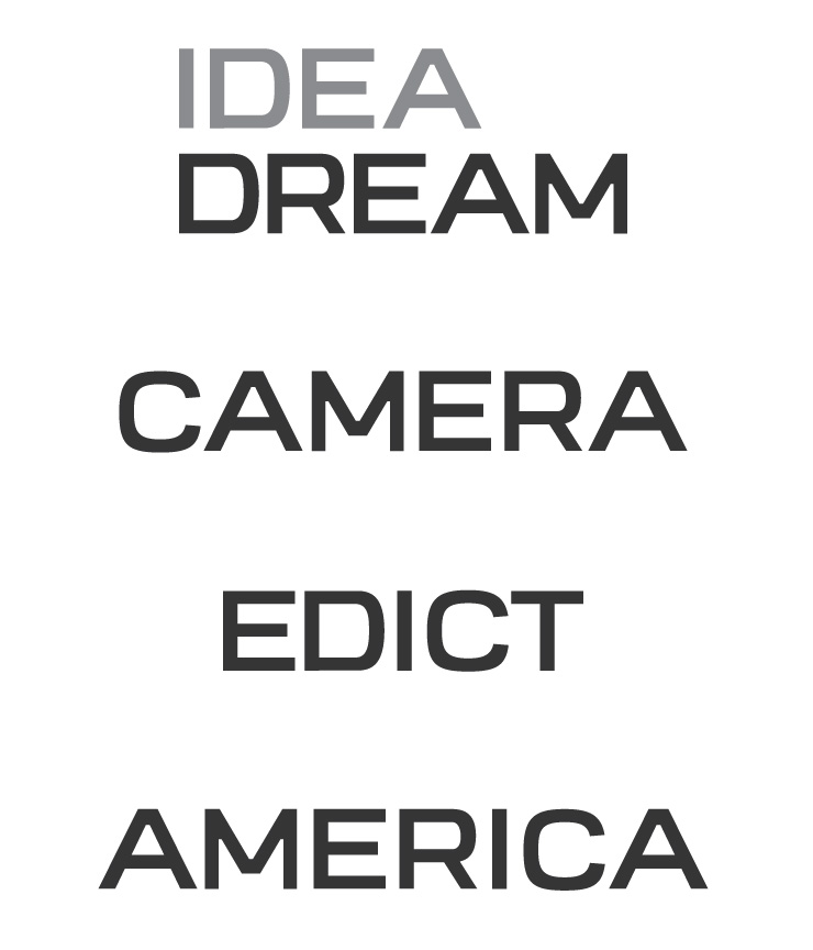
Hello, I've been working on some custom lettering that could potentially be used for our agency's corporate identity (if it turns out good enough). I'm at the point where I've been tweaking it and staring at it way too long, and can't tell what's working and what's not. Any feedback on overall balance, consistency, weight, color, etc. would be much appreciated. I'm not a type designer, so please don't omit any obvious issues!
(Don't pay any mind to the words themselves. They are just randomly chosen so I'm not showing everyone who I work for.)
-Ed
| Attachment | Size |
|---|---|
| letters.jpg | 79.19 KB |