Typophile

Very old ditionary font?

CheshireCat


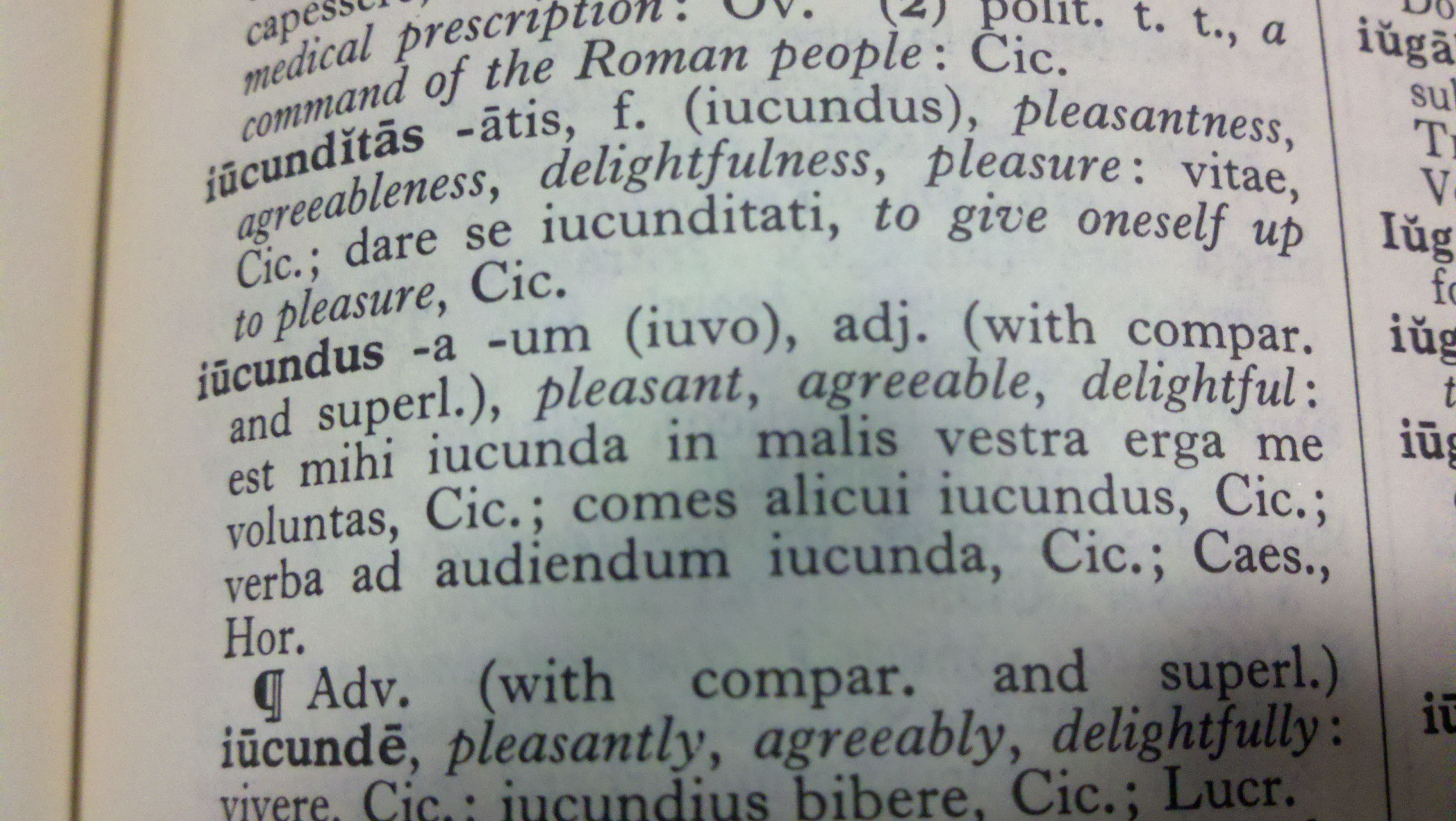
Hey guys. This is from a Latin-English dictionary from the 50s. I'm doing a business card for a friend and I want to use the two fonts in these entries. I need the bold one (the word) and the body font, just because I assume the body text is one font in both regular/book and italicized. Any ideas?

sorry for the huge size.

Difficult to tell exactly from the image because of distortions, but at a glance looks a lot like 'Imprint'. Or at least that would give you something very close!

M

how's this?


Imprint seems to have square serifs on some of the letters, while this font seems to just have rounded serifs. any other ideas?

It's a Caslon. Perhaps one of Berthold's.

Still think it's leaning towards Imprint. Too many indicators to that font to ignore.

The softness of some serifs can be caused by reproduction or printing process. For example, if the dictionary was a reprint or resized from a from a smaller or larger original (shot to film), this could cause some softening of the image. Again if set in metal, a flong and rotary drum may have been made for large print volumes which would cause slight changes to the type image. Even an original printed from metal could effect this.

I don't think it's a Caslon because of the large overshoot on the apex of the cap A. Also cap C in Calson usually (not always) has double terminating serifs. Lowercase italic g in Caslon is usually a little more idiosyncratic also.

Look for the lowercase roman k. If the upper arm appears to curve somewhat, that may identify it as Imprint. Caslon usually has this as being straighter.

Perhaps look at the imprint page of the dictionary also. What impression or edition is it etc.? This might help give further clues.

I think Michael has it right. But frankly, the digitized versions of Imprint may disappoint, as they have a high contrast, and so will not have the feel of the letter press book. I'm prejudiced, but I think Williams Caslon captures the feel of letter press better. It is more true to Caslon proportions, but the alternative style with short descenders will get you closer.

Captured from web.archive.org on 12 Feb 2011. view this capture