
Hey guys, I'm relatively new to the realms of Typophile and graphic design, in about 15 days I begin my Bachelor of Design,
My father, brother and I are partners of this company and I, due to my chosen career path, was tasked with assembling an identity.
The business is called China CV, I wasn't allowed to play with the name, its a online service that in 24 hours, using real people who can read/write both English & Chinese, translates your resume & other professional documents from English to Chinese.
This is what I've come up with -

The typeface is up for discussion, I used Lato because it is using a Free-Font License (as far as I'm aware this included commercial ventures but if i'm in the wrong I'd love if someone gave me the heads up?).
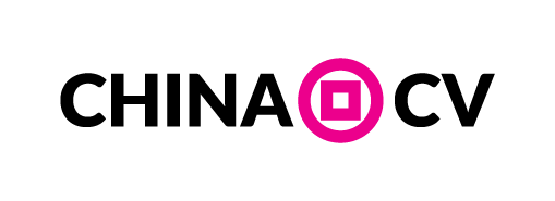
I based it on Chinese coin designs that were used for centuries, in hindsight it kind've looks like a bank, which isn't a bad thing necessarily as we are involved in e-commerce, which is renowned for 'dodgeyness'.
Tell me what you think!
Cheers
chillphilli


