Hi everyone!
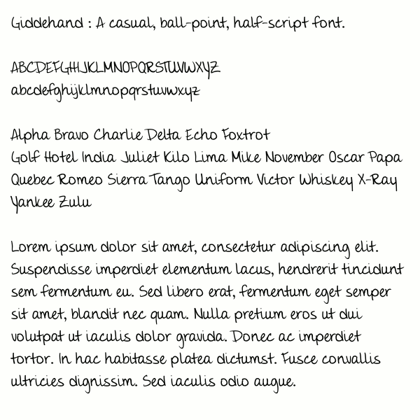
New to the forum, but I've been browsing around for a few days and thought I should take the plunge and post up my first font for critique. Go ahead and be honest; I'm a big girl and can take it :) I'd rather have it be right, than have my precious feelings protected.
So, without further ado, here's GiddeHand, an approximation of my own handwriting.
| Attachment | Size |
|---|---|
| GiddeHandTest.gif | 51.79 KB |