Typophile

Henri Lipsanen

kattttor

Hello,

Looking for some feedback on a logo for a new client.

It's a finnish golfer by the name Henri Lipsanen. The client wanted something simple and I don't have much time to do this so simple it is. He also wanted a monogram of the letters HL and the colours grey and green.

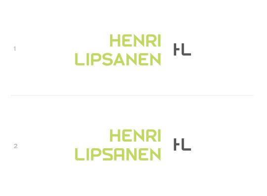
This is my first version. Some simple type modification of Insignia with a monogram that is supposed to remind you of a golf course.

Any feedback appreciated.
Peter
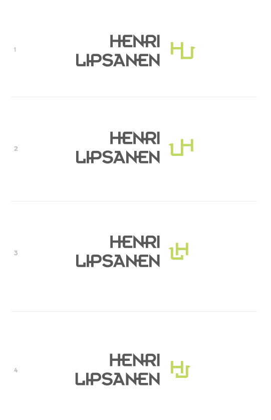
The monogram is the weakest part. HU? HV? UH? HJ?
Also, I’m not sure about a monoline typeface. Golf says curves and widths variation to me.

Yeah, the only monogram that reads at all correctly is number 3, but even then it looks like 'LH'.

The main typeface feels too 'futuristic/techno' to me. The quirky features also make it look more like a cheaply made free typeface.

Thanks,

I think the typeface works. Golf is a very disciplined game and that's why I chose a simple sans-serif with some structure and symmetry. To me golf really doesn't say curves and widths variation at all.

Removed the connections between the letters, which are default on the Insignia typeface.

Also made a new A and S.

Added a simpler monogram.

peter

I like the new type much better. Nice and clean. The green, IMO, needs to be just a bit darker and richer - less yellow and closer to grass - fall grass, not spring.

I might try adding the little flag to the first stem of the H; in both the name and the monogram? In the monogram, the crossbar break is distinctive, but it needs refinement. The remainder of the crossbar looks too short, and as a result, the break feels too big. Right now, the space is vibrating rather than reaching over the bridge.

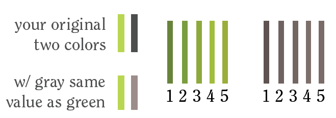
Some of these issues could be resolved with color -- right now, the green and gray aren't balanced - they're different values. It's not a bad thing, contrast can work well, but I find equal values work best in clean Swiss-style design. It's easier to show you what I mean....in this example, the matching grays are simply desaturated (in photoshop) versions of the corresponding green. I rather like the #5 pair, personally, but all our monitors show slightly different shades -- which is another reason matching values is a good idea.

The newer version is much better. I'll also echo everything Alaskan said above.

I'll echo everything Penn said above.

Get a room! ;-)

Is there an echo in here?

The "S" in #2 is problematic - it looks constructed and top-heavy. Stick with #1 (of your second post). For the monogram, I agree with everybody about the H's crossbar being too short. I also think the L's horizontal bar is a tiny bit too long. You could also try dropping the L down a bit to make it more interesting(?).

Thanks,

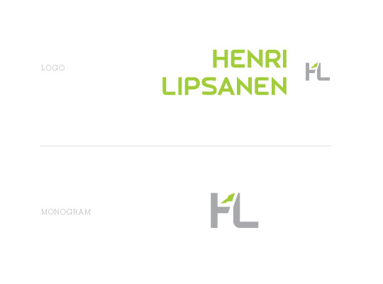
More modifications to colour and type.

Also tried adding the flag again. Do you read it as a flag or something else?

peter

It reads as an arrow, and it's distracting. I liked the flag treatment in the first set of monograms better.

Oh, and I thought your squared-off 'S' worked well to fill in the gaps created by the P and A, but if you're sticking with the traditional 'S' the stroke needs to be thinned. Same goes for your new R and P. For what it's worth...the R in your Jan 29, 5:04 post is so beautiful it's hard to improve.

Thanks,

New version

No flag, new S, thinner L, old R and P.

To lower the L in the monogram really didn't work. It started looking like a giant L and some weird letter.

That N sticks out. Apart from that this looks very nice.

I would slant the vertical of the L a bit, to add some dynamism and more of a reference to golf (golf club!).
Rough sketch:

Bert, sorry, but that looks like a hockey stick. Doesn't work for a golfer.

I like the N. I wouldn't change it, unless it's just a subtle change like softening the peaks? The only tweak I might work on is the illusion that the top terminal of the S is floating upward -- very, very slightly. Actually, now that I'm staring at it obsessively, the whole S looks a teensy bit twisted counter-clockwise.

(I wonder if I keep staring at it, it will begin spinning like a pinwheel? Hmm....nope. Whew. Insanity averted, once again.)

Does this work?

Nope. Too messy. I know you're trying to inject "golf" into the look, but this doesn't work. The space is too small to define the wavy flag, so it looks more like a broken shard of glass.

Have you tried putting the monogram atop a tee? (Maybe just the top part of a knocked-out tee?) Or inside a marker (the divot tool thingy)? The nice thing about golf ball markers is that they come in all kinds of cool shapes and...that's where this logo will end up, anyway; on a marker, a keyring, towel and/or glove. Maybe play with the shape of a fairway or green somehow? Or just the indents of a golf ball?

Just some thoughts. It's hard not to go right to the golf cliches of ball, club, flag.

or just re-draw the flag, make it bigger and have it pointing up instead of down and maybe cut a little bit of the H.

I could try all the things suggested but I simply don't have the time.

Tried a tee, looks like a nail.

What about a few blades of grass? Truth be told, this logo is finished as it is and maybe the colors alone are enough to say "golf." The items that the logo will be featured on will make it abundantly clear, anyway.

Ooh - have you considered using a shade of sand instead of the gray? Sand is golfy, right?

I believe the term is 'golfish'.

Yes, rip the flag off, you're done.

No, no. 'Golfish' is what to aim at in the water hazards. You still lose a stroke, but add a little garlic and butter, and you've won a free dinner.

man if his intials were 'FL' the flag as a part of the F would've been awesome.

I think it's perfectly reasonable to ask him to change his name for a better logo.

Yes!

"I think it's perfectly reasonable to ask him to change his name for a better logo."

Franz Lipsanen?

Captured from web.archive.org on 5 Aug 2014. view this capture