
I've been away for a while, but I'm back with a new logo that needs critiquing. The company produces and sells high-fashion jewelry and other related products. The lettering is built from scratch. How does it look?
Any comments appreciated.
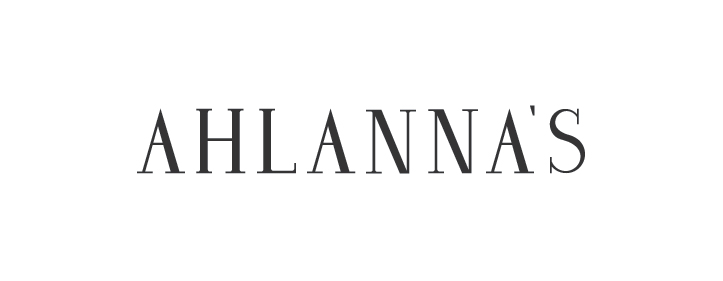
| Attachment | Size |
|---|---|
| ahlannas.jpg | 17.25 KB |


