Typophile

Laffy Fatty

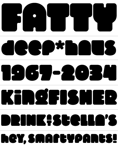
Laffy Fatty is a super thick, unabashedly kitschy display face.

AttachmentSize
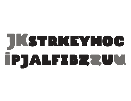
LaffySpecimen_r5-1221.06 KB
LaffySpecimen_r7281.7 KB
LaffySpecimen_r7_Words86.71 KB
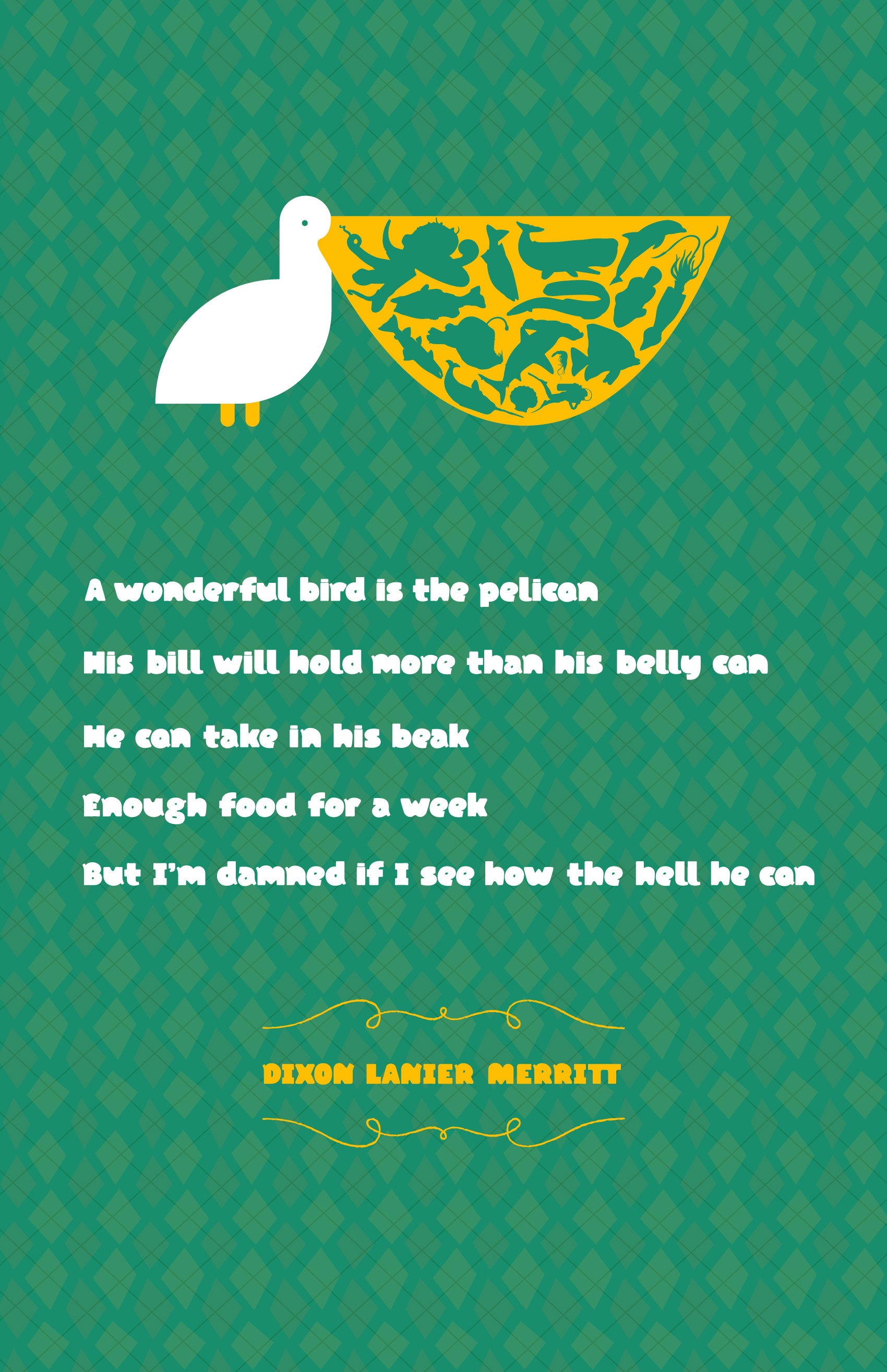
Laffy_Pelican.jpg724.69 KB
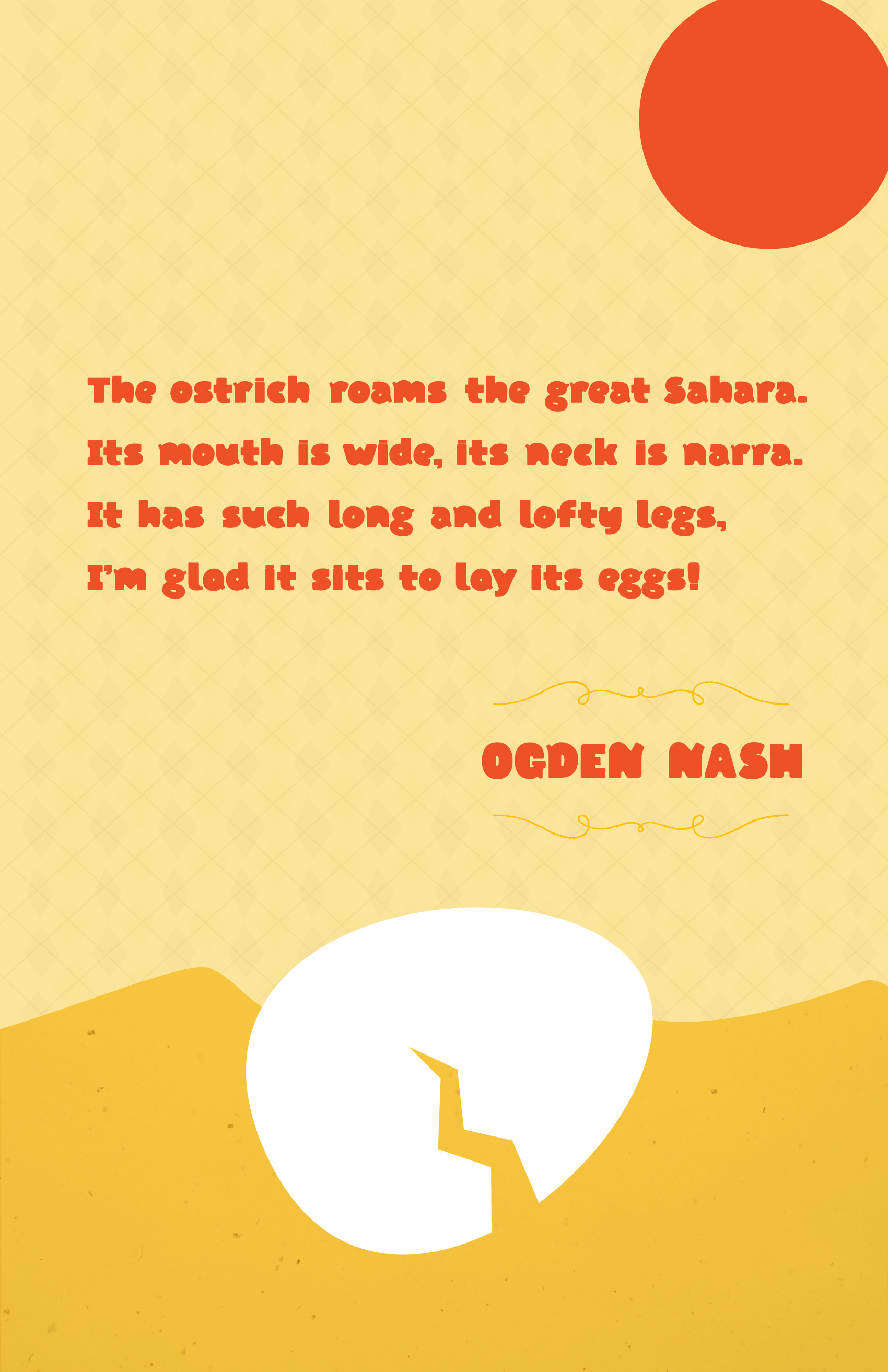
Laffy_Ostrich.jpg323.53 KB
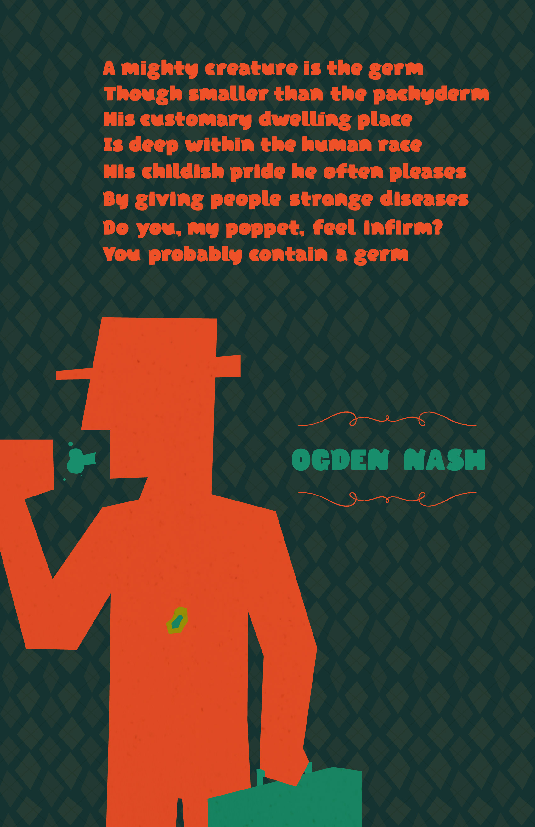
Laffy_Germ.jpg536.21 KB
Smallcaps_r1.pdf243.29 KB

I like it. It gives a really nice quirky feeling. However, I think that some of the thins are too thin. The ff and tt ligatures don't work for me. Keep going!

Yes, I'm not sure about those thin serify bits. Maybe they need to be removed, or alternatively used more widely among the letters.
/H/ may easily be misread as an /N/.
I think the figures are the best part of what you have.

@Eliason: Good call on the /H/; I hadn't thought of that. The serify bits—lets call them 'stumps'—are to me an integral part of the character of the face. They're used on 14-16 glyphs (depending on if you use the alt E and F) and there are fatter stumps on 8-12 or so more (depending how broadly you define 'stump'). So I thought it was pretty thoroughly established... Hmm... Is it just that the contrast is too much, as 1996type suggests?

I definitely agree that the numerals are the best part, which is funny since I whipped them up in about 30min from sketches through vectors.

@1996type: What is it about the ligatures you don't like?

---

In general, I need to do some x-height equalizing and such.

Here's a catalog cover (rough draft) I designed using Laffy Fatty:

Added two pdfs—a specimen poster showing a few revisions and a demo using the poetry of Ogden Nash.

Updated the specimen pdf, added 3 posters

I really like the look of it.

Are the swashes around "Ogden Nash" in the posters included in the face?

The two "It's" in the Ostrich poem should be "Its" (no apostrophe).

The swashes are actually included with Matilde.

Re: Grammar: I don't know what to say. I always have to think about which one is right, but I hate it when they're misused. Thanks for pointing it out.

I decreased overshoot overall and evened out the x-height. New version is in the files at the top. Posters are also revised somewhat, but they don't use this latest version of the face.

/G/ is the only significantly changed glyph, to which I added a spur that makes it much easier to read. Oh, and I added an ampersand.

I started the smallcaps...

Really cool. Love the character this has

Laffy Fatty is a super thick, unabashedly kitschy display face

And its uncanny likeness to Silas Dilworth's 2006 font Fatty is … pure coincidence?

Could be. Happened to me once.

If it wasn't named fatty, there really wouldn't be much similarity. There are plenty of rips in the typography world to complain about and this isn't one of them.

There's similarities, but plenty of differences.

As I said to this fellow, the issue is good sportsmanship more than anything else. If you're going to solicit design feedback in a forum populated by professional typographers, some basic due diligence is in order.

A Google search for "fatty font" would've brought up Dilworth's font as one of the top results. A search on FontShop for "fatty" would've shown it as the top result. Same with MyFonts.

"But … but …" But what? The only possible counterarguments to this principle are "I didn't know that Google, FontShop, or MyFonts existed" or "I didn't have the 10 seconds it would've taken to do those searches."

Captured from commoncrawl.org on 19 Apr 2015. original URL