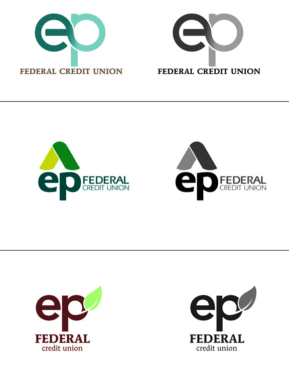
I am working on the logo redesign of E&P Federal Credit Union and would like some input on what I have so far. For a little background, E&P has been the federal credit union for employees of the Bureau of Engraving and Printing (hence E&P) but they are looking for a brand new look as their clientele demographic and business model shifts. Their main group of members now come from both a few local colleges and employees of the environmental protection agency. They are also planning to shut down many branches and become more of a virtual financial institution, where almost all banking services would occur through a new website.
What they want to say with their new look:
• Professional and trusted
• Helping the environment (by going all virtual)
• Friendly/personal
• Secure
• approachable to Generation Y
• Change name from E&P (acronym for Engraving and Printing) to EP (acronym for absolutely nothing)
…you get the idea, the same thing every financial institution wants to be viewed as
Here are the general concepts for the three logos you see below:
First image is their current logo.
LOGO 1
• Reinvention of the infinity symbol to incorporate the letters EP
• Interlocking letters are secure yet kinetic…like your money should be
• Rounded letters are friendly
LOGO2
• Arrow pointing up…towards the future and showing positive growth
• Also feels like a protective roof
• again, round and bold shapes feel friendly
LOGO 3
• This is a leaf...I know, cheesy but I'm thinking money tree and the environment both connect to "leaf"
Any conversation about this work would be helpful and appreciated.