Typophile

ID Help: Newsletter font use

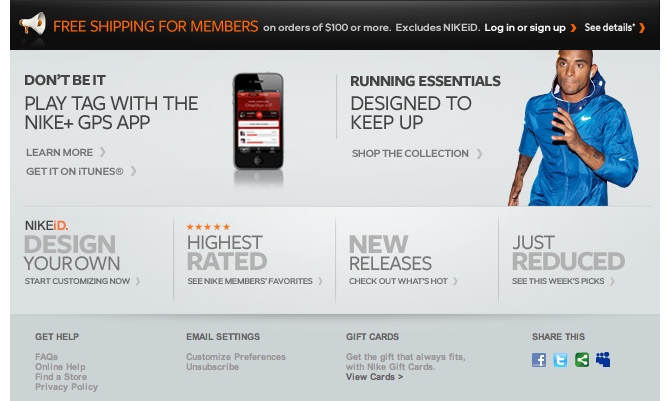
Hello everyone. I would appreciate some help with identifying the font in the image. It's a screenshot from a newsletter sent by Nike and although I was thinking it may be Futura, my eyes fail me. The S, G, and R differ and I would like to possibly use this font in an upcoming project. Thank you for your time, I look forward to your feedback and thoughts.
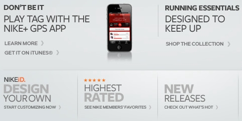
Probably Gotham.

Renko, I would say Gotham is very close. However, the "M" does not dip all the way down the middle. It stops midway, and another portion of this newsletter I I have the "M" dips all the way down to the baseline. It is very close nonetheless.

I've posted another screen shot to see the letters in orange. The "M" is visible in that part. Any further thoughts?

akira1975 thanks for your reply. Freight Sans looks spot on but I'm questioning the "R" and the width of the "U". I did sample it at 24pt on the site you linked me to and if it is this one, I'm buying it tonight. Thank you.

Hmm, why don’t you check it up also at Fontshop?

Thanks akira, you are right. It is Freight Sans and it renders better in the sample view on Fontshop. I will look into purchasing this font later this week. Thank you for your help.

Captured from commoncrawl.org on 28 Apr 2015. original URL