
This is for a fitness company that gives out tickets. They wanted it to be motivational, 'head-turning', and energizing.
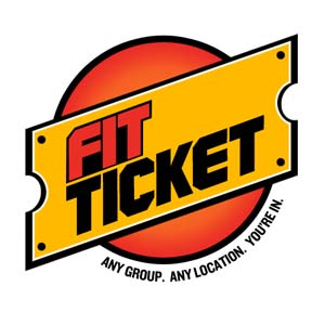
This is for a fitness company that gives out tickets. They wanted it to be motivational, 'head-turning', and energizing.

I'm not a trained graphic designer, so take this with a grain of salt, but I have to wonder if the tagline will be legible if the logo is used at a small size, such as a on a business card.

Why the black under FIT?

Energizing, yes. Head-turning, ok. I'm not sure a logo can be motivational, but this one's punchy at least.
An issue to consider: the black dots in the corners and black beveling make the ticket shape look like a riveted metal plate. That combined with the machined lettering made me think "auto parts."
You've got some energy, now rein it in a bit, find where that energy is coming from and preserve that—and only that.

The large empty space after "fit" sucks the energy out of the logo. I'd suggest making "fit" much larger. "Ticket" could be much smaller; the ticket shape already communicates that message. Make "fit" the typographic focal point.
The black fill below "fit" reduces contrast; I'd eliminating it.
Small type below logo is way too small.
To me the orange background circle draws too much attention. Focus should be on the ticket and name, not the background. I'd either eliminate it or tone it down in some way.
Maybe the ticket itself should be orange, and the type reversed out in white.
Don't mean to sound overly critical with all these suggestions; just trying to offer some friendly advice.
Thank you all for your input! I have come up with a new revision. Is this an improvement?
Thank you all for your input! I have come up with a new revision. Is this an improvement?

I think it's a definite improvement.

I like it better too. still a concern on how little/long the tagline is. Curious, do you need the gradient circle behind the ticket shape? omitting it might give you a better place for the line, maybe?
Much stronger. The tagline might still be too small - try it on a business card. Also try it on a website. Perhaps you need an alternate version w/o the tagline or with the tagline in a different location for those uses?

Looks nice. Your "Fit ticket" is too big. It needs more margin around the letters to make it easier to read. Another idea is to put "Any Group. Any Location" on top so you can make the text slightly larger and put "You're In" on the bottom.

Looking good. One small thing, and I think this might be more of an issue for me than for people in general:
You have a scaled-up copy of the shape, which results in an uneven outline when my eye expects to see an even one.
Fit Ticket is too big, and the tag line is way too small. The circle doesn't connect; the top and bottom halves look disconnected. It could be optical, but that's irrelevant to the reality that it looks wonky.
Captured from web.archive.org on 25 Apr 2015. view this capture