Due to confidentiality agreements I cannot disclose the nature of the business or it's location.
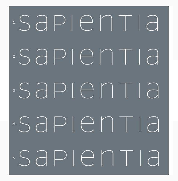
Hereis a concept I'm working on for a client that is modernizing, and unlike any in it's sector. They want to convey that, yet look serious, legitimate, and corporate-clean.
I'm doing it with a san-serif set in unicase (custom). Screen resolution is making some of the vertical strokes appear different.
Feel free to critique my kerning and character widths and anything else relating to this logo.
Cheers.