
Working on a logo for a website selling some whimsical art posters and t-shirts, etc.
I found this font on some post on this site and really like it so now I would like to get some feedback on the logo.
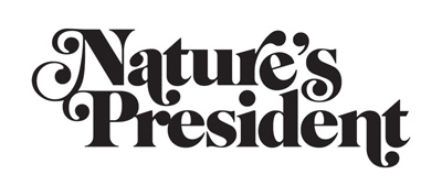
Working on a logo for a website selling some whimsical art posters and t-shirts, etc.
I found this font on some post on this site and really like it so now I would like to get some feedback on the logo.

That treatment says retro hippie organic more than whimsical art posters. The tilt of the /e/ and the kerning are what stands out (in a bad way) typographically to me.
can someone explain a bit what's bad about those things please?

Top line appears to be sloping downwards from left to the right. Other than that I think it is a close enough fit for what you are after, and it is a very nice typeface.
The errant e puts me in mind of nothing so much as a sign fallen into disrepair. I picture it on the wood siding of a storefront in an old outlet mall.
Thanks for the feedbag! I really do like the font and even the idea of it looking like an old hippie sign in disrepair, I'm pretty anti-corporate.
Captured from web.archive.org on 19 Apr 2015. view this capture