Hello,
I´m a student and i need help with a Logo.
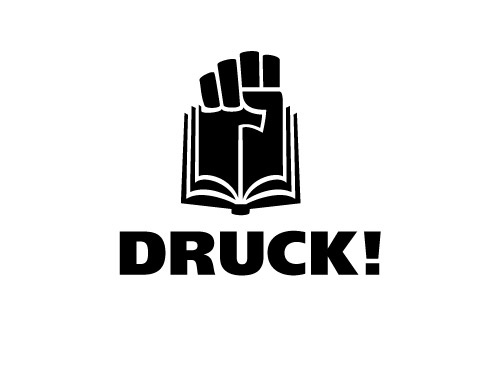
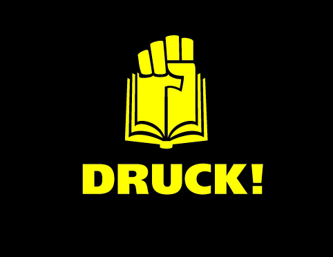
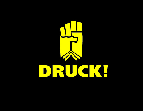
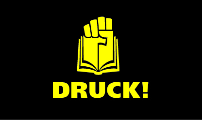
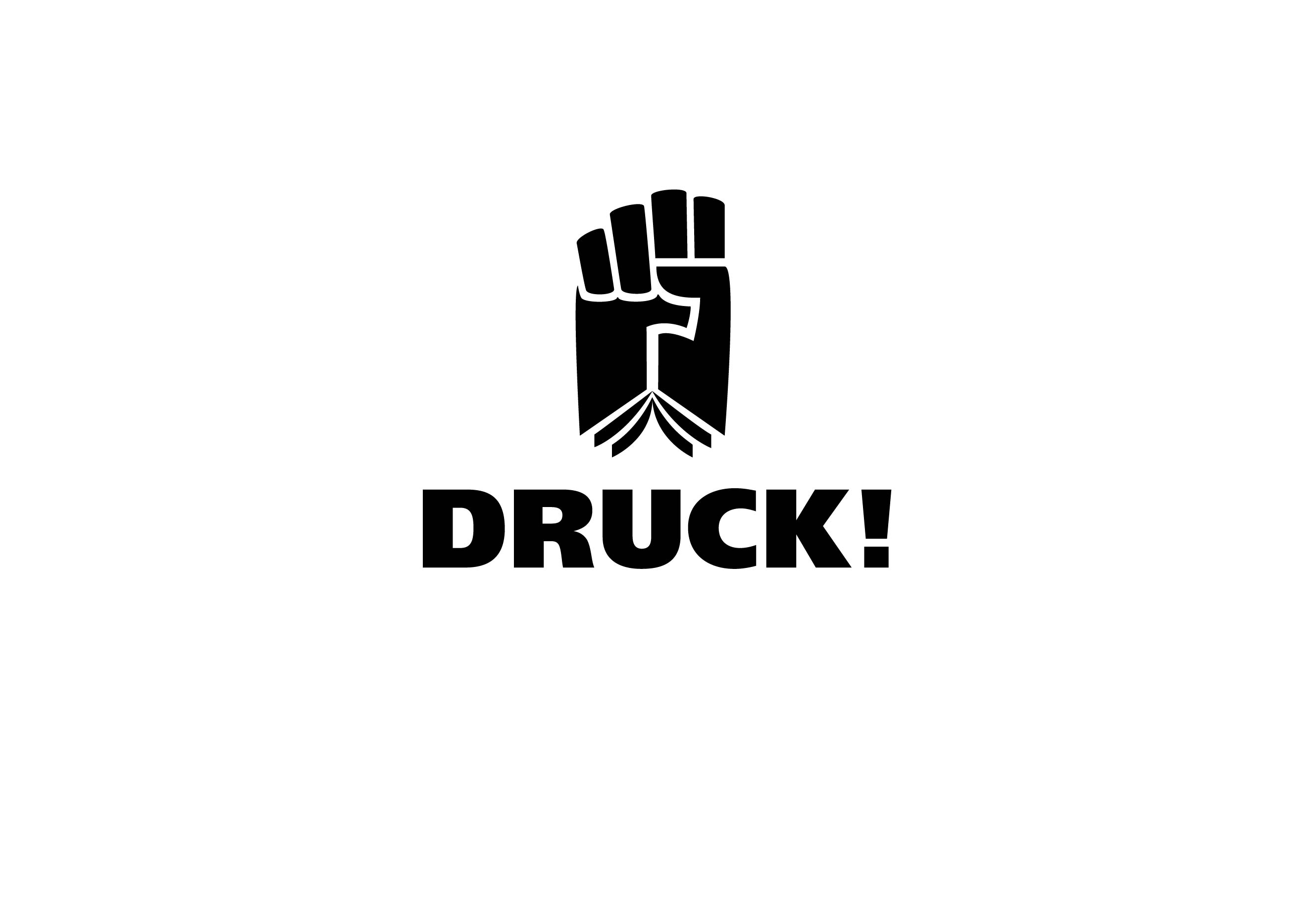
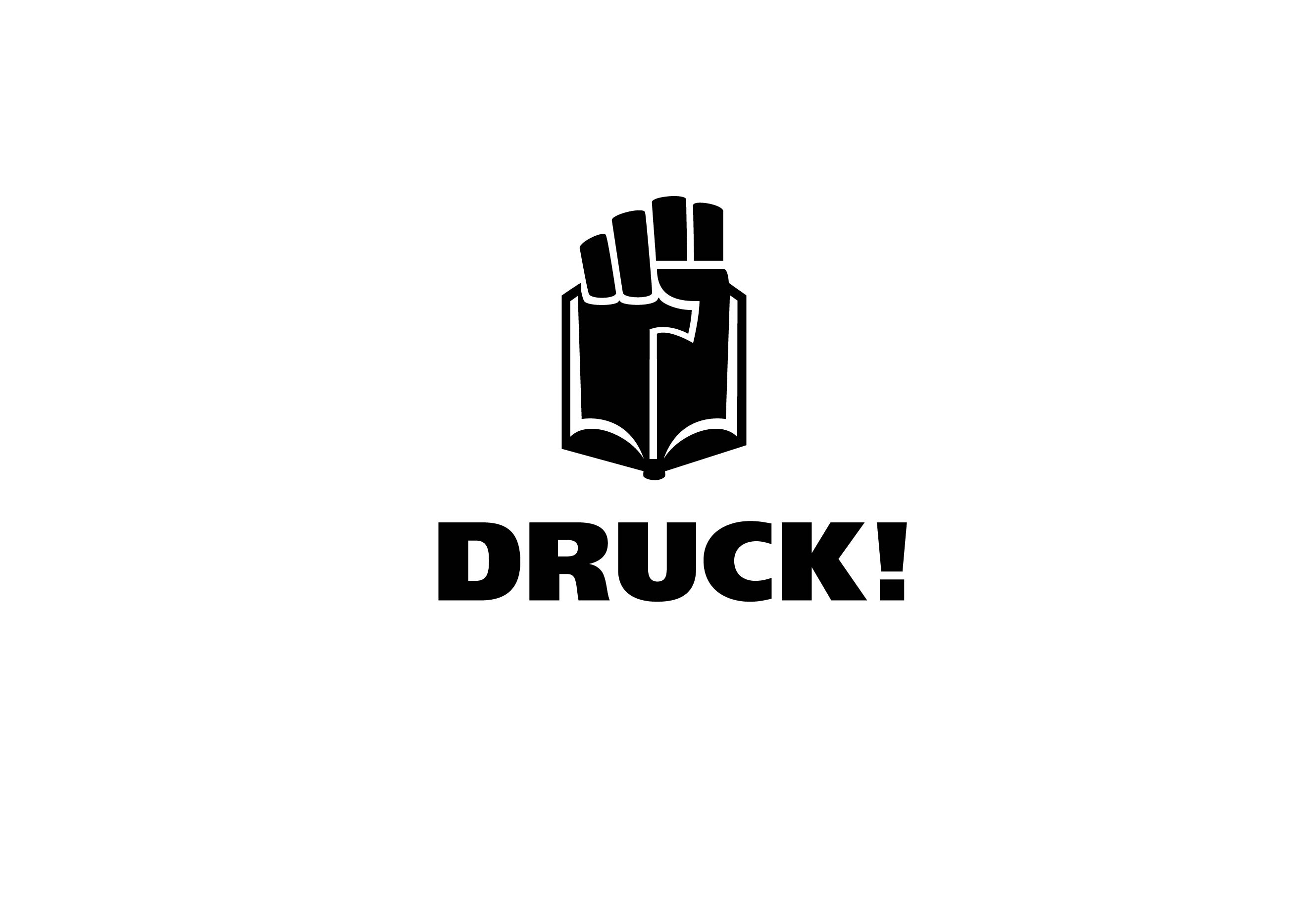
It is for a group of people, who fight for printed products (against e books, online newspapers etc.) This group is not real, i invented it. The Logo combines a fist and a book. Some people I asked could not see the book. I made another version in which you can recognize the book better, but it is not as aggressive as the first attempt. I want it to be aggressive. "Druck" means "Print" in german.
Can you think of a way to make the book better recognizable in the first attempt? Or do you see other mistakes I made?
Thanks a lot in advance and excuse my bad english.
| Attachment | Size |
|---|---|
| Druck_1.jpg | 718.24 KB |
| Druck_2.jpg | 719.71 KB |