
this one:
.
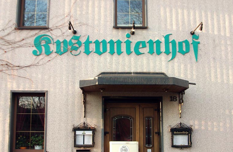
this one:
.

:^D. For international readers: It should read »Kastanienhof« …

Ta. I kept asking myself what the blakes Kustunienhof was.

Ouch.

Must be due to the bad Warsteiner beer they’re selling …

I noticed the bad baseline on the s, but not the two upside-down a's.
Still, it just goes to show how obsolete and forgotten Fraktur is.

What a find! :-)
> it just goes to show how obsolete and forgotten Fraktur is
I think it mostly really goes to show that people are idiots. The same thing happens with whiteletter. Like in this gem: http://www.flickr.com/photos/48413419@N00/347980084/
Broken scripts forgotten? Neither in Germany nor in Great Britain, i would say.

I think both of these were caused by untrained installers--something like Fritz and Freddie work at the mall as floor sweepers, Sam Smashed, the sign guy didn't make it to work because he was, well, smashed. Sam's boss was in a pickle so he asked Fritz and Freddie if they wanted to make a few extra Pounds or Euros and they said sure! Sam's boss drew a nice straight line on the wall and told them "the bottom of the letter sits on the line." Fritz did the German, and by god, he followed directions on EVERY letter. Freddie did the English but Freddie was actually Sam Smashed's nephew so he got, well, smashed, too. He thought the difference between uppercase and lower case was a question of how high the beer cases were stacked. The rest is history ;-)

I noticed the bad baseline on the s
It's upside-down too.
… how obsolete and forgotten Fraktur is
yes but obsoleteness doesn’t prevent people from inventing new design solutions ;-)

Last year I had to get some stick-on letters for a licence number to go on a boat.
Went to the Canadian Tire (hardware) store, but they didn't have all the letters I need in the size required.
I was tempted to improvise.
So I can imagine Freddy and Fritz wanted to get the job done, but the sign store was out of "a"s (hey, it's a popular letter) — no problemo! — being the creative chaps they are, their design solution was to get the available '"u"s and rotate them, and to disguise this shortcoming, they f*cked up the "s" and "e", and the positioning of the word (non-centred), to complete the drunk punk aesthetic.

As long as the client's chegue cleared it's all good.
"...to complete the drunk punk aesthetic."
LOL!!!

I assume, that the food in this restaurant tastes, like the lettering looks. Fat and hairy. Furthermore I have a dark vision of yellow disinfection blocks in the sanitary facilities. And you better should not try the wine in that restaurant, not to talk about tea.

how about this http://twitpic.com/3n16zb

Nick:
If these were flipped /u/s it could be called creativity, but these are flipped /a/s. ;)
Nina:
I think it mostly really goes to show that people are idiots.
This is rather the ‘Geiz ist geil’ mentality (why hire professionals?) than classic idiocy.
They probably got their letters on ebay (‘letters available in black, white, cassis or Windows95 petrol – easy self installation!’).
They just got what they deserve. I don’t even want to know what their dishes look like.

Nonconformists

It's one thing to have a bit of fun with font; it's another thing to make it unreadable. Why did they pick sea green (or whatever color that is) for their title? It looks out of place anywhere, much less as the sign for a restaurant.
But sea green Fette Fraktur (or Luftwaffe or whatever)... that just takes the stollen!
I assume, that the food in this restaurant tastes, like the lettering looks. Fat and hairy. Furthermore I have a dark vision of yellow disinfection blocks in the sanitary facilities. And you better should not try the wine in that restaurant, not to talk about tea.
This must have been the briefing the letter-screwers got handed over. So it’s *good type*, after all.

>I think it mostly really goes to show that people are idiots
Eek. I'd think most typophiles would like it said that more education is required.

More typographic heresy…
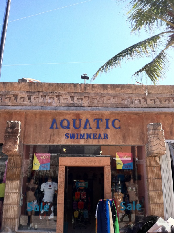
It’s not only the lettering. It is the “mity” plastering with the shadows of bars or the smut of old flown tears, the cold smoke of non and never known court-martialled shots, the menu boxes, the small dark windows, the patinated brass. It is a Warsteiner restaurant. It is the typical German kind of glumness (even if this Kustunienhof is not in Germany), “stuffyness” and fatuity. It is the place, where grey Eau de Cologned ramblers revive – with single wrapped towelettes in fear-sweated faux leathern driver licence pouches.
I always read A without crossbar as Lambda.
Do they sell many KIΛ cars in Greece?
Suphoria:


Anyone noticing the 'e' angle?
Jaja... It's like those "Find the 10 mistakes" games!

How does this even happen? Amazing.
I guess the signmaker had no A's so (s)he used inverted V's instead. But why the latter W in SWIMWEAR is an inverted M... no sure idea.
David, I agree on education – I didn't necessarily mean the incurable kind of idiocy. :-)

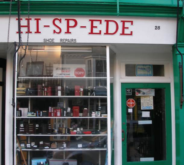
I'm actually rather fond of this. I like to think the the upside-down S is intentional but the spelling is a mistake.
When Ede decided to start a shoe repair shoppe he already had the perfect name for it …
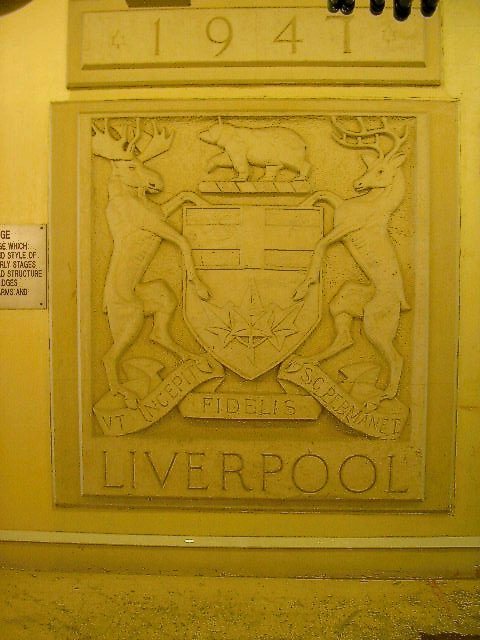
substituted 'L' for a '7'
Post-war shortages, Russ?
when you are all out of '7's, you can always give 'em 'L'.
LOL!!! That and a puff of fireworks for Aussie Day! ;-)

Oh-my-god!
That Fraktur example is... unbelievable. Didn't ANYONE notice this when they put it up?? I would have the company redo it or refund my money!! :-)
Captured from web.archive.org on 23 Jan 2015. view this capture
