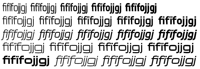
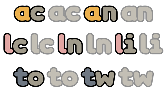
Jelle Bosma's Cambria uses a contextual replacement of the letter f with a variant that has a shorter tail when followed by ascending letters such as i, b, k, l, h, f, or by accented letters. This seems to be an elegant technique which avoids the need to making multiple ligatures.
Which other typefaces use that kind of technique? (Not necessary just for f, but also to resolve some other conflicts such as with the letters g or y).
Many thanks,
Adam