
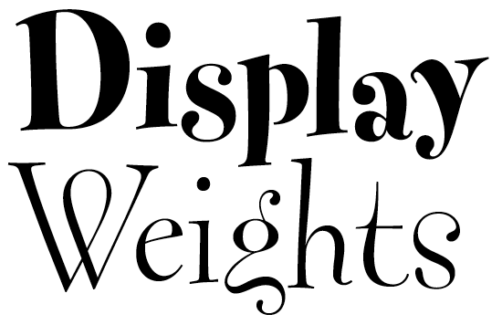
The FF Fontesque OpenType upgrade presents an interpretation of the typeface that is more sophisticated than the original grunge-era rendering, with the addition of finely-detailed display cuts, increased language support, and many OpenType features — most notably a pseudo-random effect.
“RANDOM” FEATURE:
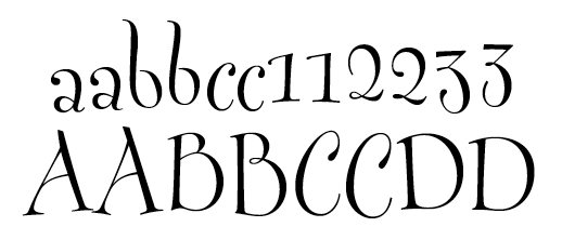
The Contextual Alternates feature of OpenType has been exploited to create a pseudo-random effect. There are alternate glyphs for every character (including all spaces, accented characters, punctuation, figures, ligatures, &c.) so that each is represented by two different glyphs. Most alternates are similar in structure but slightly different in proportion, alignment, and detail, so that the overall effect enhances the original premise of Fontesque—the appearance of graceful, whimsical hand lettering without mechanical repetition.
The "random" effect is automatic. Here's what happens behind the scenes:
1. Toggle
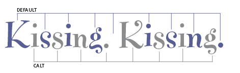
This causes every other character in text to be a “calt” glyph, so that when a character is doubled, the two glyphs are different (note double “s”). It also provides two different “looks”—useful for optimizing the appearance of display settings. And of course, further refinement may be made by manual selection from the glyph palette.
2. Proximity
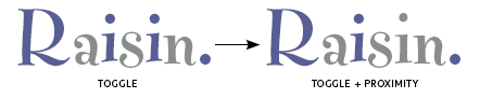
When an alphabetic or numeric character repeats, separated by a single character, the second instance is programmed to be the other glyph for that character. Therefore, the closest that a glyph may repeat is when separated by three characters. So, with just two sets of glyphs and the “Toggle + Proximity” system, repetition will not occur until the fifth character. This works because there are no languages in which an alphabetic character appears three times in succession (with the exception of a few German words).
ALL CAPS:
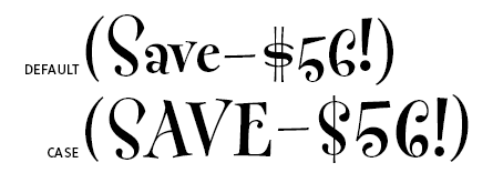
“All caps” (case) feature includes:
- monetary symbols
- lining figures
- brackets
- hyphens & dashes
- guillemets
OPTICAL SIZES:
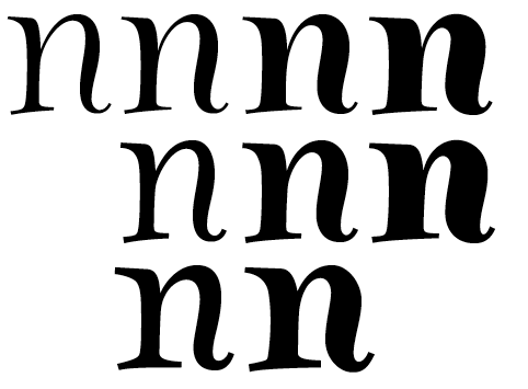
The addition of display weights emphasizes how the Fontesque OpenType makeover presents a more sophisticated interpretation of the typeface than the original grunge-era rendering, with carefully refined drawing of the glyphs. Now there are three optical sizes: Display, Normal, and Text.
ORNAMENTS:
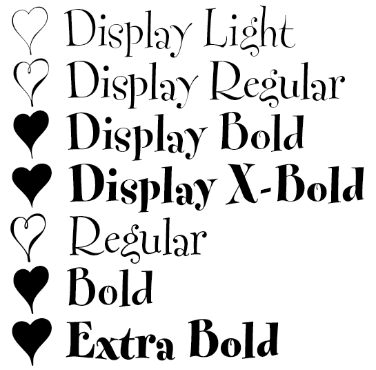
Each font now includes all 59 ornaments, and they have been rationalized:
1. The same number of ornaments in each font.
2. No “flipped” versions of ornaments.
3. Ornaments are weighted according to the font they are in.
4. Light and Regular weights have “open” ornaments, Bold and Extra Bold weights have “solid” ornaments.
GERMAN:

Cap Eszett in all styles.
CYRILLIC:
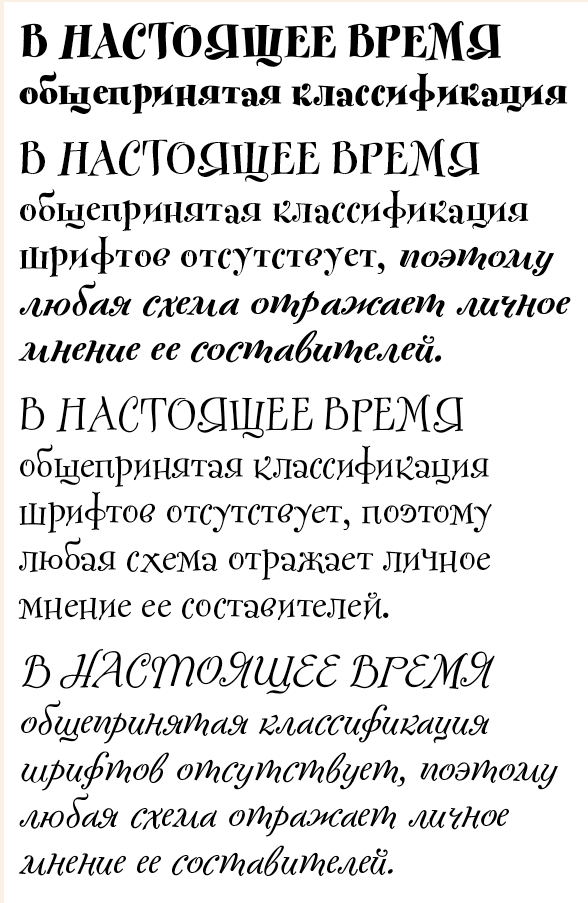
As with the original Latin script version, the Cyrillic is assiduously sick, and (so far), quite unlike any other Cyrillic typeface.
SUPERFAMILY!

The sans too has been upgraded, although not to the extent of the serifed Fontesque.
Fontesque Sans Pro features oldstyle and lining figures, ligatures, ornaments, and full European Latin script coverage, but no 'random' feature or Cyrillic.
The new Fontesques are available at FontShop in these formats:
- OT
- Pro
- Office
- Web


