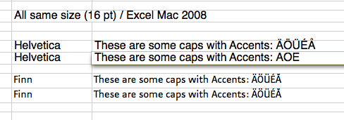
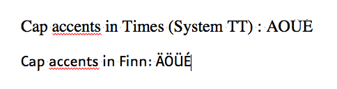
I am wondering, if there are still any standards on how tall you draw your letters within the em-square.
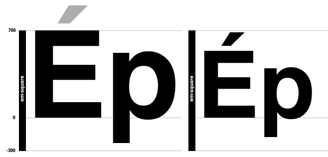
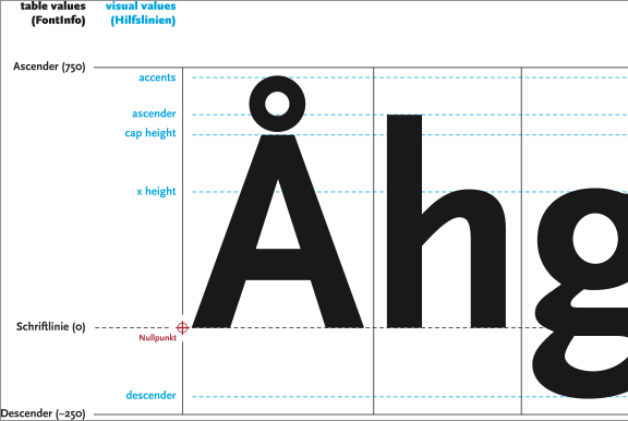
Formerly type foundries had their own standards on how "big" a typeface was drawn into the em, usually with a standard cap-heigt of around 700 units (within 1000 units for the em). The x-height, ascenders, descenders etc. were then apropriately scaled to meet the cap-height standard.
Today it occurs to me, that type designers don't use any standards any more (right?). I found these arguments for that - do you find anything further?
- with a cap-height of around 700 upm, some parts of the font (accents or even ascenders) will reach out of the em and will be cropped in some programs (on screen).
- if line spacing is left to auto, it often looks too tight. Sometimes ascenders and descenders even touch. If the letters are drawn smaller into the em, the line spacing looks larger and in most cases better.
- on the other hand, some users might get confused if a font with the same point size all of a sudden looks much smaller.
- also some fonts with tiny details might have "resolution" problems when drawn too small (e.g. Zapfino with extremely tall ascenders).
In my own practice I tend to scale the letters down, so that all (or at least most) parts of the font are within the 1000 units of the em. Nothing gets cropped, line spacing looks good, but some users have to get used to apply bigger point sizes when they use the font.
What are your habits?
Do you decide from case to case or do you use your own standards?
Are there other arguments I missed?
Thanks for your thoughts,
oliver
PS: I am not interested in the technical aspects of the metrics as discussed here:
http://www.typophile.com/node/77906