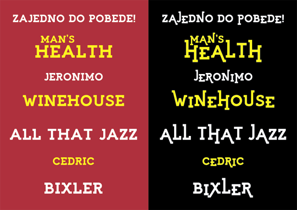
This is my first slab serif ever done (or tried). The aim was to make something like mixture of geometrical flows and strong, stable shapes and to make a more modern look of usually sharp shaped slab serifs.
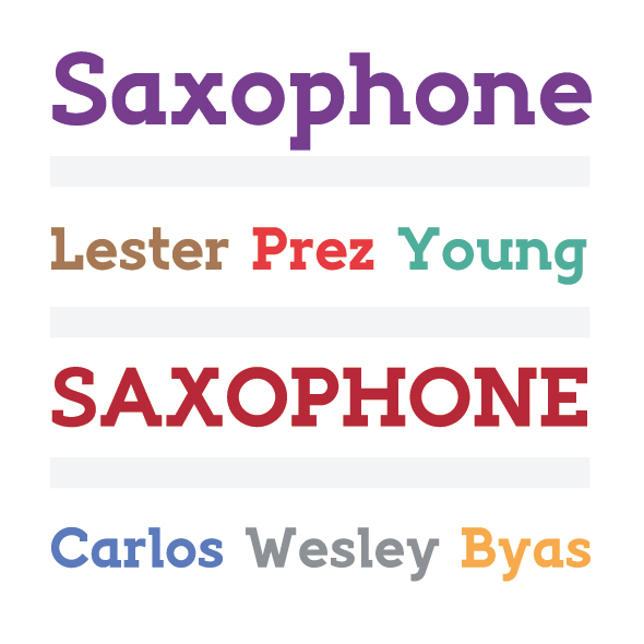
So far, I'm thinking about making also Italic for this one and probably that would be the whole family, even I tried to make something like Regular and Light versions of this "Bold" that you see, but so far, I'm not so sure about doing that.
I didn't showed numbers 6 and 9, cause I'm not pretty satisfied how thay are looking currently.
No spacing and kerning applied in this samples.
Any constructive comments are welcomed!
* I updated PDF.
| Attachment | Size |
|---|---|
| Saxophone_font_test.pdf | 195.45 KB |