Typophile

Personal Logo Critique

fathairyape

Hi Typophiles!

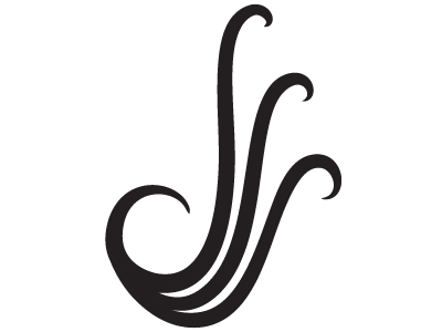
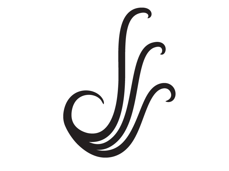
My initials are d, l, and s, and they are really hard to put together into a personal logo. Believe me! This is my seventh official attempt at constructing a cool identity. I sort of want to convey professionalism and perhaps invoke a little mythology (a little hydra/lochness monster comes otu of it) while at the same time having my initials (a) evolve into each other and (b) come together as a what some might call a typographical swash or like something you might find in Adobe's Wood Ornaments type.

I'd love your artistic opinions on it--I know it's not done yet, but I don't know what it needs exactly. It is coming off a little bit messy. I'd love to hear what you have to say so I can finally finish it! I'm attaching a larger version. Thanks again in advance!
AttachmentSize
Personal Logo.jpg79.16 KB

The curves aren’t there yet.
Especially the bottom left one: either it should be rounder or straighter.

Thanks for your comment riccard0. Should I just keep playing with them until it "works"?

I think it has potential. Give yourself a direction and keep tweaking! :-)

Updated some of the curves... am I on to something?

I think it will look more natural if the curves don't connect all at the same point.

It still looks like SSS or sls to me. The 'd' doesn't really come through.

@Té Rowan: Where do you think they should connect instead? I kind of like how it looks like a bird with wings if you tilt your head a little bit, and I'm worried about complicating it if I separate the curves. What are you thinkin'?

@Trevor Thanks for your comment. Any ideas on how to make the ''d' more prominent?

Was thinking of spreading them further apart on the curve. Of course, you might prefer the 'root branch' look...

Is it supposed to suggest hair?

I think the d comes through more than anything, but I don't see an I or S anywhere unless i'm told.

@Neeko That's an L, not an I, sorry!

Have you tried rotating it anti-clockwise a bit so your d is back-slanted (like script on old maps), your l is more upright and you have space on the right to put more of a curve into the lower half of your s.

@Justin_Ch - Grr! You worded it before I could!

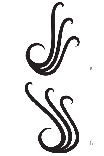
Good suggestion! Here're now the two ones we have, 7_1 (a) and 7_2 (b) side-by-side.

I think b reads better like a 'd' and 's', 'l' is kinda tricky. i might suggest smoothing out the inner curves on the bowl of the 'd'. what it look like if you rotated the whole piece another 10 degrees clockwise? looking good!

This doesn't mean you shouldn't use the logo, but I think any hopes you might have that somebody will pick out three different letters out of this, unprodded, are in vain.

agree. still a nice mark.

Perhaps you over-compensated the tilt in b . To improve readability you could thicken the bowl of the d and perhaps close the gap of it's tip a bit more. For the three top tips make the d's almost (but not quite) straight, the l's less so and keep the s's as is to have a progression of curvature. And/or you can detatch the d from the set at the bottom making a small gap between it and the edge of a cursive capital L which remains joined to the s as it is now. That would need a flatter bottom curve of the L+s ligature. I tried it it looks good that way.

Thanks for all the comments, guys. I'll make the changes tomorrow. And just to clarify, @eliason, I think you bring up a good point. I don't think it's necessary that every initial is picked out, especially because I like it being a little cryptic and it will mainly be accompanied with my name below it--I just want to maximize legibility and clarity. :)

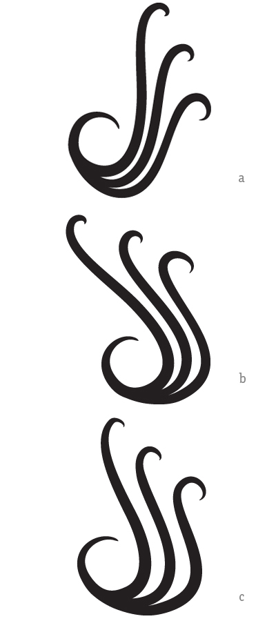
Ladies and gentlemen, I present to you... c!

Still a dodgy curve on the third 's'

Since you really only need the full curve at the top for the /s/, you might try raising it and stopping those other ascenders lower and straighter.
That way the whole thing will take on the the silhouette of an /S/ and look less "hairy"

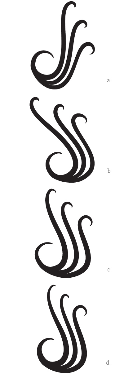
Wow. I really didn't like C. Here's D. Thanks so much for all the comments--took a fresh look at it and worked with the comments to smooth out C and trasmute it into D a little bit. Thoughts, now? To be honest, I'm stuck between A and D... don't know if I'm playing favorites to the former because it was the first prototype, though.

I like version d best, but if you want to make the l read better I'd uncurl the hook at the top a bit. However it's a nice image even if the letters aren't spotted.

I agree fathairyape - without major changes to improve readability and yet preserve a dynamic simplicity, (a) is the most satisfying design. Its cool, and looks like a bunch of musical notes

Pubes!

Awesome :)

Captured from web.archive.org on 19 Apr 2015. view this capture