Hey everybody,
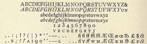
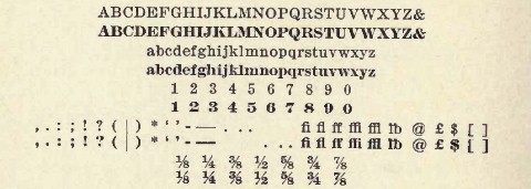
I would like to make the widths in my new typeface, Sensato (see critique > sans), consistent. Delicious by Jos Buivenga instantly comes to mind. It seems to me, that due to kerning, it's impossible to keep widths exactly consistent. Does anyone of you have experience with this?
1. Is there any use to a font in which the widths are 'almost' (due to differences in kerning) consistent in width through different weights?
2. What are prime examples of fonts width consistent width in different weights?
Cheers,
Jasper de Waard