Typophile

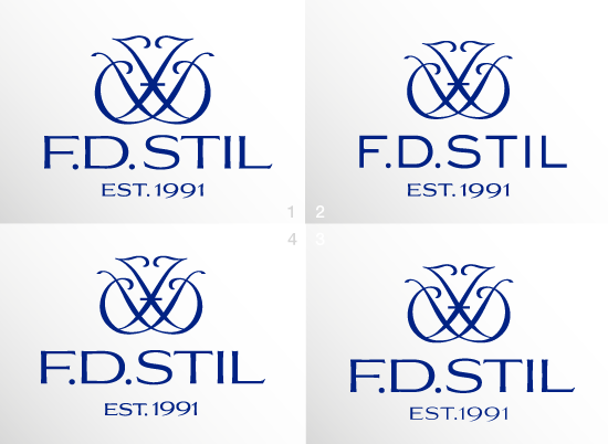
Logo for chandelier producer.

Dumitriu

The company is designing and producing custom made chandeliers. This is part of a re branding process changing the 80' look to a more classical looks.
What do you think, i like the font and the monogram but is a personal choice.
Please comment this choice.
Many thanks.

Dan

AttachmentSize
FDS-LOGO.gif31.35 KB

It's nice. From what I recall it's better than any of the options you posted in the previous thread some time ago.

For the 'EST. 1991' line I would loosen the tracking a bit and perhaps switch to small caps / old style numbers. Also, since there's such a large wordspace between 'EST. 1991', the space between 'F.D.' and 'STIL' looks rather small.

I agree with penn, and I'd add that the text is optically off-center. It might me mechanically correct, but because of the L being so open, it needs to shift to the right to look correct.

I think a typeface like Sackers Gothic might look really elegant here.

Which one is better ?

Top right, for me.

1 also.

Top right, but you still have some rather glaring kerning problems and it's still optically off-center.

I like the suggestion of the monogram/ chandelier in the top left image. Maybe put the Est. 1991 in sans serif small caps?

I mean the suggestion in the clitoral-serif type

Sorry.... what is clitoral-serif type ?

I have no idea what Bloodtype is talking about, but for the love of type, don't Google it.
Maybe it's some sort of twisted joke?

I just mean very small, amost residual serifs

Oh, vestigial serifs.

It's a great look overall - especially the top right one without the oversharpened corners. Besides the mentioned kerning/optical center issues my one question would be as to the necessity of the "est. 1991" line at all - it just gives off a cheap impression on what otherwise would be a very classy logo.

Captured from web.archive.org on 5 Aug 2014. view this capture