
hello every one
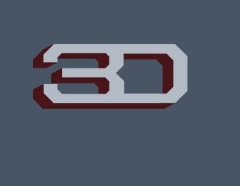
am working on an identity for an architectural firm thats specialized on consecrating and 3d modeling am seeking advices and comments about if its fitting the purpose and what fond should i choose? its called 3 dimension architects

hello every one
am working on an identity for an architectural firm thats specialized on consecrating and 3d modeling am seeking advices and comments about if its fitting the purpose and what fond should i choose? its called 3 dimension architects
its construction not consecrating sorrry :D
I'm afraid your 3 could easily be mistaken for a 5 and your D could be a zero. Also, the perspective angles of the 3D effect are too extreme so it actually looks as if the figures are slightly twisted, and the top of 3 is falling backwards a bit. I'd keep the angle consistent, like a traditional archictural drawing. Look up isometric, axonometric and oblique projection if you're not familiar with technical drawing.
I think the look is a bit too '90s techno for an architectural firm.
should i build it in a 3d program and trace the lines?
and i should completely change the font figures ?
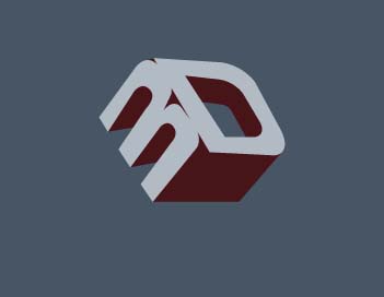

You can put the logo on a cube.
I am an architect and a nice perspective cube can look very well with 2 letters on each side.

The angle of the 3 confuses me; is it a wonky 3? Is it a 5?
I must admit mahmoudhassan's top idea provides a less confusing and more satisfying solution.

hey, i recently designed an architecture logo and had a similar approach. i found this in my preliminary ideas. modified it a bit and added a stem for the 3 and cut into it to read more clearly. not saying use this one, but my thought was to use the space of a floor plan.


Hola, nice belt buckle!
mahmoudhassan, I think you need to go back to the brief and work on concept development more. It seems like you are trying to make the letters 3D into a 3D form, which lacks conceptual connection to architecture, and seems a bit too obvious. Try to dive into what makes the company unique, great, or memorable, and find concepts that capture that feeling or idea. Hope that helps!
wow! that was helpful. Thanks Luma. very enlightening.
belt buckle or not, it's different. a different perspective is all i was offering. =)
hola, are you the same person as the OP, mahmoudhassan?
I'm not sure I understand. What is OP?
OP means "original poster," meaning the person who started this thread.
no. i'm not the original poster of this thread. i did however recently design an architecture logo and thought it might help mahmaudhassan see that 3D doesn't have to look 3D. why do you ask alaskan?
Mahmoud needs to come back and explain a bit more about the company. I think they might not be architects themselves but they do 3D modelling for architects, in which case it probably is three dimensions rather than architecture they need to convey, plus they have a very specific target audience.
Captured from web.archive.org on 5 Aug 2014. view this capture