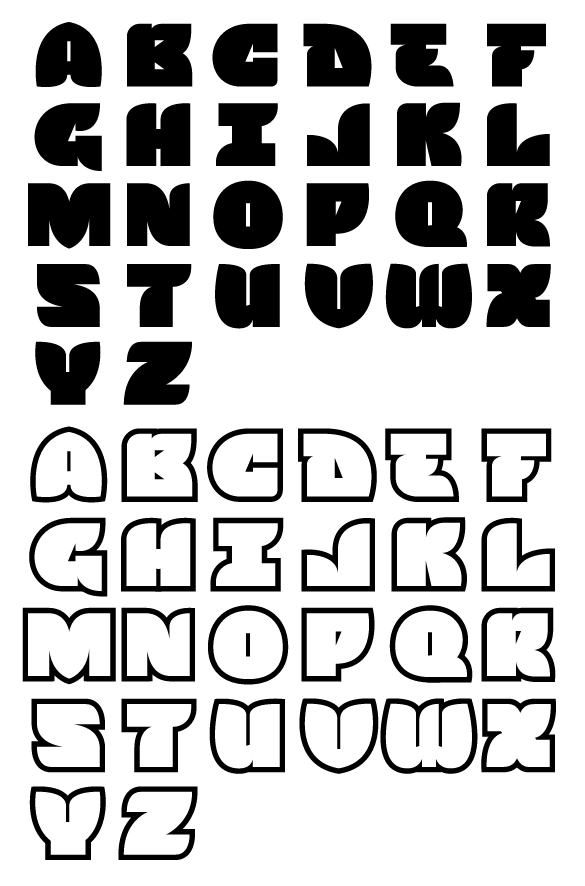
No name for this bugger yet. It's my first attempt at creating a full alphabet plus punctuation for an actual font release! Inspiration came from a custom logotype I created that was not commissioned, it's a great excuse to dive into FontLab and see what it's all about. This will be an all caps display font, released at some point this year. Here is a screenshot of the regular and outline versions. I've attached a PDF for closer inspection.
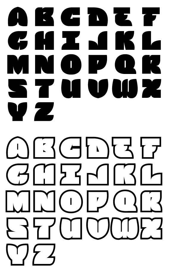
| Attachment | Size |
|---|---|
| SNS Full Alphabet 006.pdf | 88.71 KB |