Hi everyone!
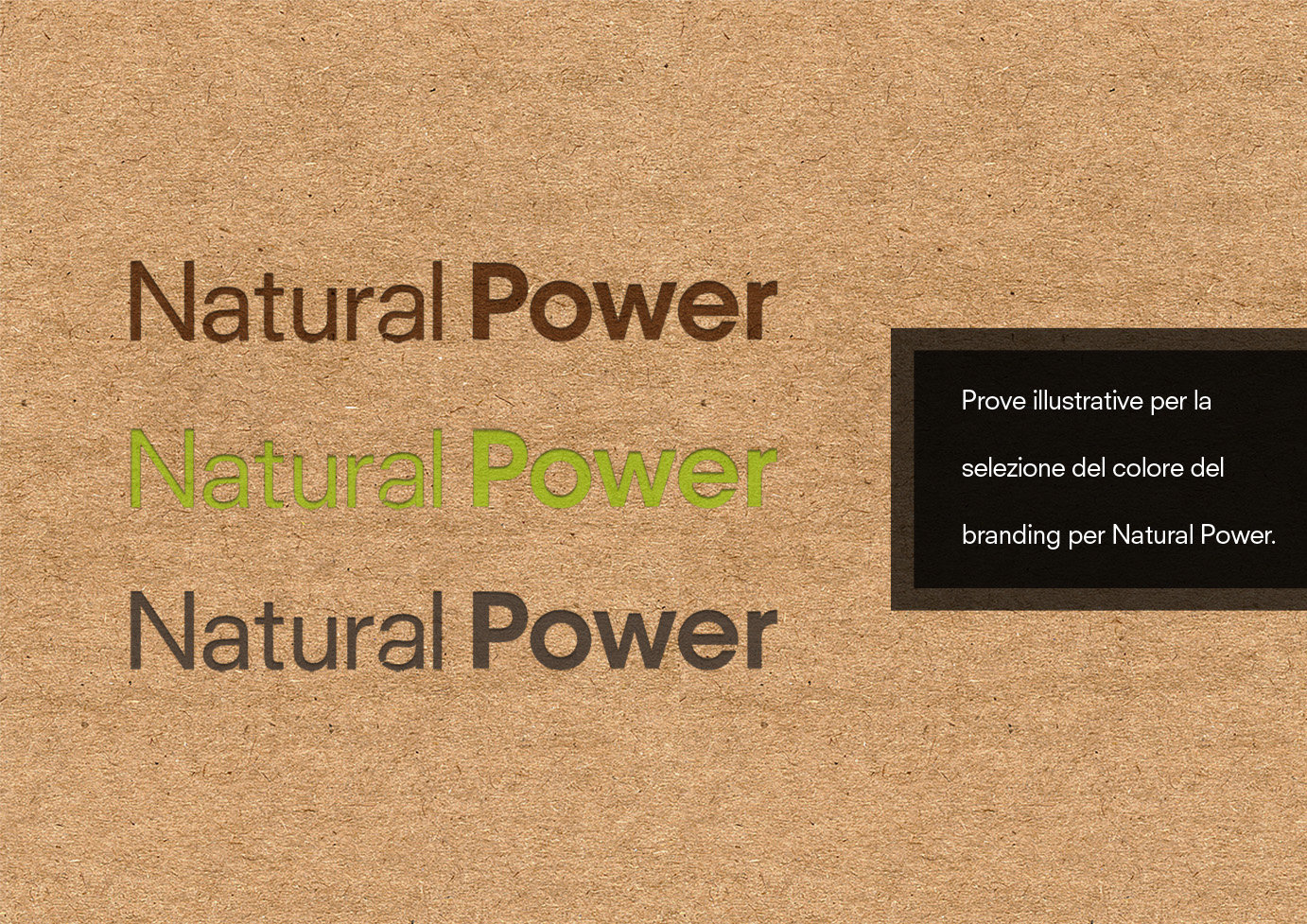
I need to choose the Colour for my latest logo. The logo is of a Renewable Energy Company called "Natural Power" and it needs to communicate profesionality and eco-friendliness.
For this purpose we already established the form of it, a simple text with a leaf recall on the word "Natural".Also, the word power is in bold to emphatize it's meaning.
We are now arrived at the colouring stage.
You can find two pictures with 3 concepts each. Wich one do you think will be more effective, taking in consideration that it will be printed on cardboard with a little emboss going down? Wich one does it seem to fit better to the eco friendly image of the company in yours opinion? Thanks for taking the time