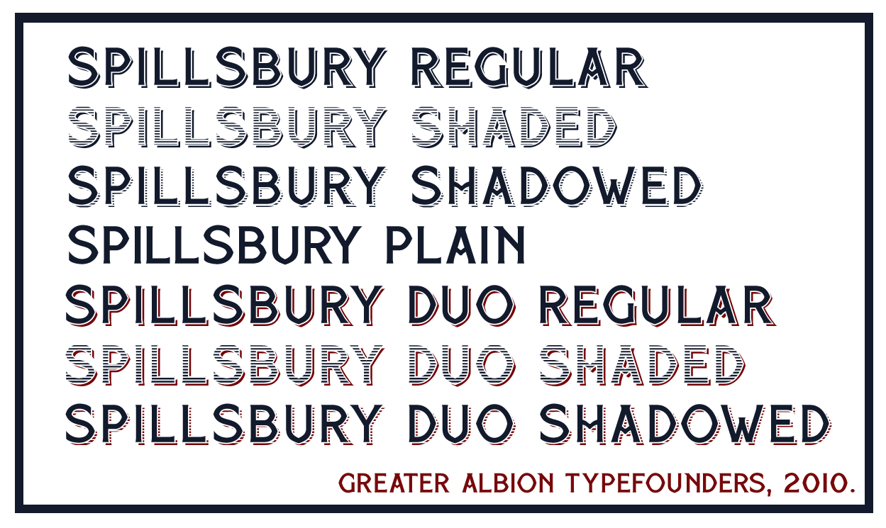
Greater Albion Typefounders has just released the Spillsbury family on Myfonts.com.
Spillsbury was inspired by some examples of 1920s signwriting (principally seen on the side of some vintage vans-good thing they were in a photograph and not on the move!).
Spillsbury draws inspiration from these sources to provide a unique combination of legibility and flair, which echoes the charm of advertising and publicity material from the halcyon days of the 1920s.
A basic range of four display faces os offered - Regular, Plain (not all that plain really!), Shaded and Shadowed.
In a new departure for Greater Albion, three pairs of 'Duo' faces are also offered. These are designed to be used in pairs-and only sold on that basis for little more than the cost of a single face-to provide for two-coloured typographic design, enabling the recreation of those evokative two coloured blocked lettering styles that were used to such good effect in the past.
Take a trip back to more colourful times today with Spillsbury!