
I am looking for some feedback on a logo for a company that makes wooden toy blocks / construction kits.
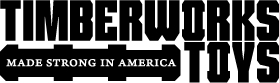
This is the original logo:

This is a revised logo:

Any comments or direction would be appreciated.
Thanks.
I am looking for some feedback on a logo for a company that makes wooden toy blocks / construction kits.
This is the original logo:
This is a revised logo:
Any comments or direction would be appreciated.
Thanks.
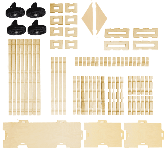
I should have mentioned that in the original logo the T / I and the O in TOYS 'represent' pieces from the toy sets.
The is carried over in just the O in both words in the new logo.

Have you considered stacking it in 2 or 3 lines, instead of 1 extremely long line?
I know from experience that a logo that's very wide (relative to its height) can create problems in layouts where width is limited.
Yes, but I haven't come up with anything worthwhile. The length of the first word which is quite long vis a vis the second word which is quite short which has me stuck.
Tank Lite has an alternate W with flat sides that might look more mechanical. Tank was made to be squeezed so you can make the whole thing narrower if you like.
oops. dblpost.

Why is Timberworks pluralized? Isn't that a company name?

Why not:
TIMBER
WORKS
TOYS

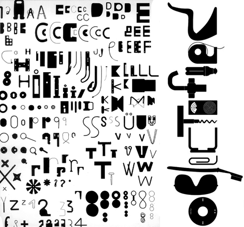
Have you considered getting hold of more toys, and building a playful alphabet of toy shapes. Here is something Paul Elliman did which is rather beautiful:
Timberworks is the name of the company, and is plural. That's how it's registered, that's their trademark, etc.
Bloodtype, that was a thought, and the example you provided is compelling, however this toy is only composed of a dozen plus pieces, so I am not sure how we could get to 26....!
> TIMBER
> WORKS
> TOYS
I'd definitely explore that 3-line approach. I'd probably add a hyphen. The cutout in the "O" vaguely looks like a reversed-out hyphen anyway, so an actual hyphen might not look out of place after Timber.
Another approach to lessen the length would be to wrap the name into a shape. For example, make Timberworks an arch with Toys centered beneath it. Or wrap the name around 3 sides of a square or diamond shaped (reversed out of the shape, I mean).
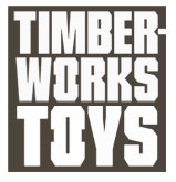
It seems to me that the timber & works need to go together...so, a 2 line version…
Just playing around with it...

I can't quite put a finger on it, but I don't like how the O looks. It looks... hmm... unpleasant. Sort of sticks out, but not in a good way.
Ah, I know - it somehow reminds me of a razor blade.

Thanks apankrat...very insightful!
If the O had square corners it would resemble the wooden blocks better. The second ones in the photo of all the different shapes looks a lot less razor-like, and would make a great O if stood on their shorter side. As it is, the fact that your O doesn't look so much like one of the blocks makes its treatment look a bit unnecessary to me.
No one has mentioned the original logo....does anyone like it?
I like it. It looks more fun than the new one and it seems to offer more possibilities for the construction set. However it doesn't convey the durability of the toy which the new logo does, even if it didn't have the "made strong" tagline. Perhaps you could add that line to the original.

what I like about the old logo is that it has some character/life to it. it may not have said solid or durable, but it did connect a 'fun' aspect to it. the revised logo stripped it clean of it's character. to me it's just too plain. I do however kinda like it better in a stacked layout, like JamesM suggested. maybe you can also alter the box shape to be like one of the toy blocks. just playing around. =)
How about a badge style?
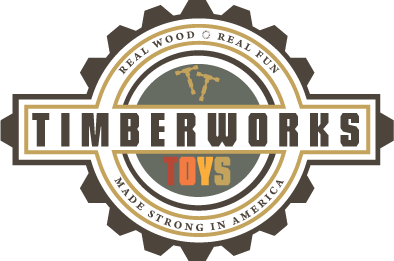

That's it! I think this is just what you're looking for. I think you could replace the brown in 'Timberworks' and the outline of the badge by one of the colours from the word 'TOYS'. I think you should also make the word 'TOYS' more obviously conntected to 'TIMBERWORKS'. The colours of 'TOYS' are beautiful however. Perhaps you could give 'TIMBERWORKS' the same colouring as 'TOYS', but that might take away the robustness.
Goodluck!
Cheers, Jasper
Hola's suggestion is also worth considering, though it needs some colour.

The colour that 'TOYS' is set in clashes pretty harshly with the grey circle. I'd be making the grey circle much lighter. My opinion.
Badge shape works.....I think. Honestly, it's currently too busy and too crowded to judge. The tag lines are way too small and will be totally illegible at smaller sizes.
Also, it's a bad idea to design in color, IMO. Get it down in black and white then add color. Even then, I'd say use three colors maximum. The multi-colored words are really not working, especially with all the other stuff currently going on.
Definitely better stacked. Think you have over played idea and lost clarity: choice of typeface with lopped off corners instead of curves fights and breaks down the nice idea of echoing the shape of the play pieces in the 'O's. As you haven't copied the proportions of either of the actual pieces in those 'O's they do not obviously read as the play shapes (especially with that extra confusion of the lopped off corners). Why not use one or the other piece shape accurately? Pull them out in colour? Photograph of piece version? Possibly only one 'O' not two? Some other condensed, blocky face good idea but would also close the letter spacing up v tight to emphasise those 'bites' out the 'O' and let them stand out.
Captured from commoncrawl.org on 26 Apr 2015. original URL