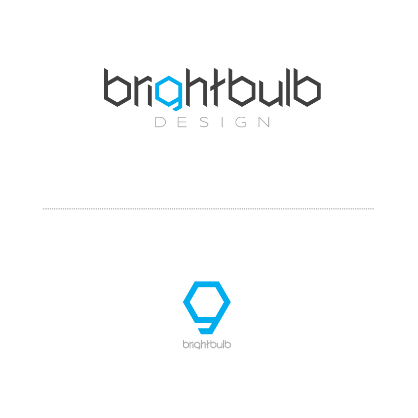
Hi all, I'm new to the site and have to say I'm totally in love with it. I've decided to produce a new identity package for myself as it's been about two years since I put together the current one, and it is no longer a fair demonstration of my skills. The upper font is my own creation, and in branding myself I felt it was a good idea to start with something I've created and move on from there. Critique away, tear it apart, just keep in mind, I'm a noob to font creation and typography.
| Attachment | Size |
|---|---|
| Bright-Bulb-Logo-Redesign-1.jpg | 43.65 KB |