
A friend of mine started a new business called Cocktails 4 U. He gives cocktail workshops and serves as entertainment on company parties and such.
For creation of the logo I wanted to stay away from the cliché cocktail logo's. Instead I tried to find an appropriate typographical solution. (look attachment)
This is the look and feel that I was aiming for:
- 60ties cocktail vibe
- classy but not too chic
- red, black and white
(think NBC's show Mad Men)
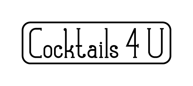
Now with the logo more or less done I am looking for a sans serif corporate typeface.
Gill Sans Light (Condensed)
Frutiger Light (Condensed)
.....
...
More/better suggestions?
Feedback on the logo is also very welcome. ;-)
