
Hey,
Any comments will be appriciated, as usuall :)
Thanks!
Elsi

Hey,
Any comments will be appriciated, as usuall :)
Thanks!
Elsi

I and S look heavy compared to the rest. And the visual play is either too subtle or not subtle enough.

The space between the L and A bothers me a little. You might try tightening the kerning there (or even overlapping) and adding a bit more space between the other characters.

If you are trying to achieve an effect of accentuating the negative space (around the OLPR), you may want to increase the weight of all the characters in the logotype. This will then allow for the figure-ground relationship to be better represented. There are many logos out there that illustrate this well, as I am sure you are aware, however only a few of them work really well. Take a look here to get a better idea on figure-ground theory.
This is a great word-mark by the way, I love how it incorporates the idea of a star/poles into the letterforms! Great job.
@Riccaro0 - agree with the letters I,S. Can you explain the second part of your sentence please? I'm kind of confused about the sign being too/not subtle at the same time.
@James - I tried to make the space between the letters according to the space between O&L and L&R (the star..). I'll try to see if it still looks ok when I ignore this consistency tempt?
@Wesley - Thanks for the useful link. Question: if I increase the weight of all the characters - won't I end up with the same relations between the figure and the ground? I played a little bit with it, and couldn't see the difference. Any other tips on how i can accent the negative space?
Thanks guys.
Elsi
I'm kind of confused about the sign being too/not subtle at the same time.
I just mean that, for a better effect, you could go either direction.
> I tried to make the space between the
> letters ...[consistent]
Just to be clear, I was referring to the space which I've highlighted below in red, which is much larger than the space between any of the other letters. To me it almost looks like 2 words — POL and ARIS
Of course it's unavoidable to some extent when you put those 2 letters together, but I'm just suggesting that you compensate a bit more.


A's leg is in the way? Kern comfortably you can't? Pew pew... :)

Made some changes..
- ?
Thanks,
Elsi


Another option for helping close the LA gap would be to construct a straight-sided, flat-topped A.
Maybe the arms of the starshine should be equal in thickness (at least the ones opposite each other--OL and PR)?
I think that curves instead of straight cuts would suggest a star better.
Thanks all.
Referring only to the LA gap at the moment-
Here are some -fast- solutions.(Eliason - did you mean to numbers 3,4?)
To me, each solution gives a different 'funny' space.
My thought is that I should keep the name Polaris as simple as possible without adding small changes that might draw the attention. This way, there will be a clear seperation between the two elements: letters and sign.
I think number 5 or 7 (original) might do this work well.
What do you think?
Thanks.
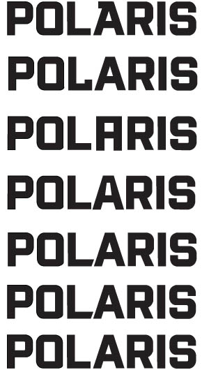
I meant like #3, but round the top corners.
LamaKova, another approach to even out the spacing might be to add more space everywhere except between LA.
Below is just a quickie example; I didn't try to fine-tune the spacing exactly, but you can see how the LA gap is less noticeable.

Another approach would be to use upper & lower case instead of all caps, although I guess you'd lose that star-shaped negative space between lines if you did that.
Sorry, couldn't resist. Just playing with the geometry.


apankrat - nice.
agree, #3 with rounded corners. you could also bring in the bottom of the L a tad bit if space between the 'L' and the 'A' gets to big.
also,i feel the weight of font should be consistent in both words.
The OLPR star, which is pretty clever, really needs to either be brought out more or dropped altogether. I couldn't figure out why the two P's and the two R's were different before reading the replies; it just looked like there was a diamond, and it was like, ... huh?
Also, tightening the L-A kerning presents a dilemma: either the two words won't be centered anymore, or the OLPR star will have to go.
Thanks all.
@JohnJamesSmith0 - as you wrote, the L-A gap affects the other elements on the logo. I’m still trying to figure out how to solve it.
Hi
I feel as if I'm running after my tail here.. would appriciated some advices about:
Why is the letter S in the word Polaris floating there?
Is it its curvy shape? It’s relation to the previous letter I? How can I ground it?
Does it feel like the P of Polaris is left out if taking it in relations to the word Press? (notice the relation of the letter S in the two words..)
I did some changes. I assume there are hard to be noticed. I like the second version with the diamond shape for the star.
What do you think?
Thanks
Elsi
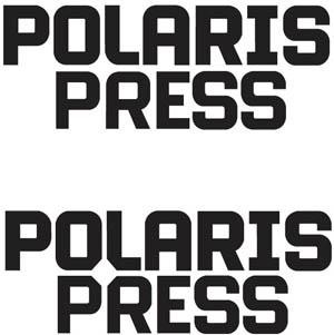

Now the 'E' is too narrow.
- Lex

Hmm... serifless I, wider E, both lines flush right... will that even work? Or do I need another beer?

It's probably too cheesy, but you could easily articulate the star using something like this and not cause confusion:

Captured from web.archive.org on 5 Aug 2014. view this capture